

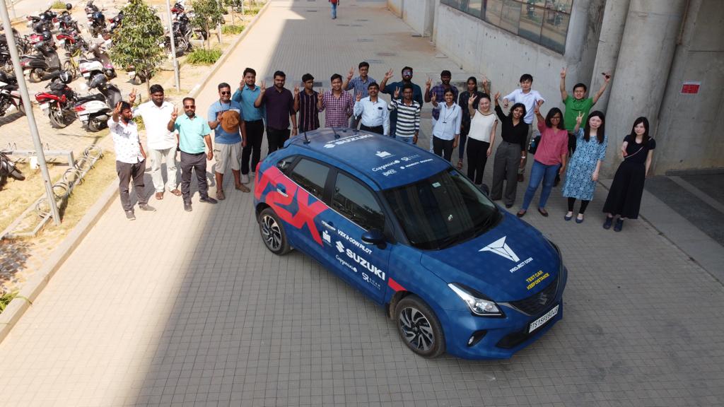
Suzuki Motor Corporation, a Japanese multinational based in Hamamatsu, had partnered with IIT Hyderabad to launch an innovative knowledge exchange center. Together with Maruti Suzuki India, they are developing V2X (Vehicle to Everything) technology to enhance road safety and reduce congestion.

My role
Team
Timeline
2 Months
Context
When this project began, there was already a screen in place for Suzuki’s V2X system but it was far from driver-friendly. Developed by engineers, it displayed raw, backend data in a dense and complex way, making it impossible to use safely while navigating the road. The challenge was to transform this cluttered interface into an intuitive, real-world tool, tailored specifically for drivers tackling the unique chaos of Indian roads.
Impact
💪🏼 The improved driver experience made a strong impression during a successful demo to government officials and the IIT Hyderabad community. It set a solid foundation for Phase 1 of the project, paving the way for further advancements in V2X technology.
Highlights
Driving Smarter: Alerts, Maps and Real-Time Indicators

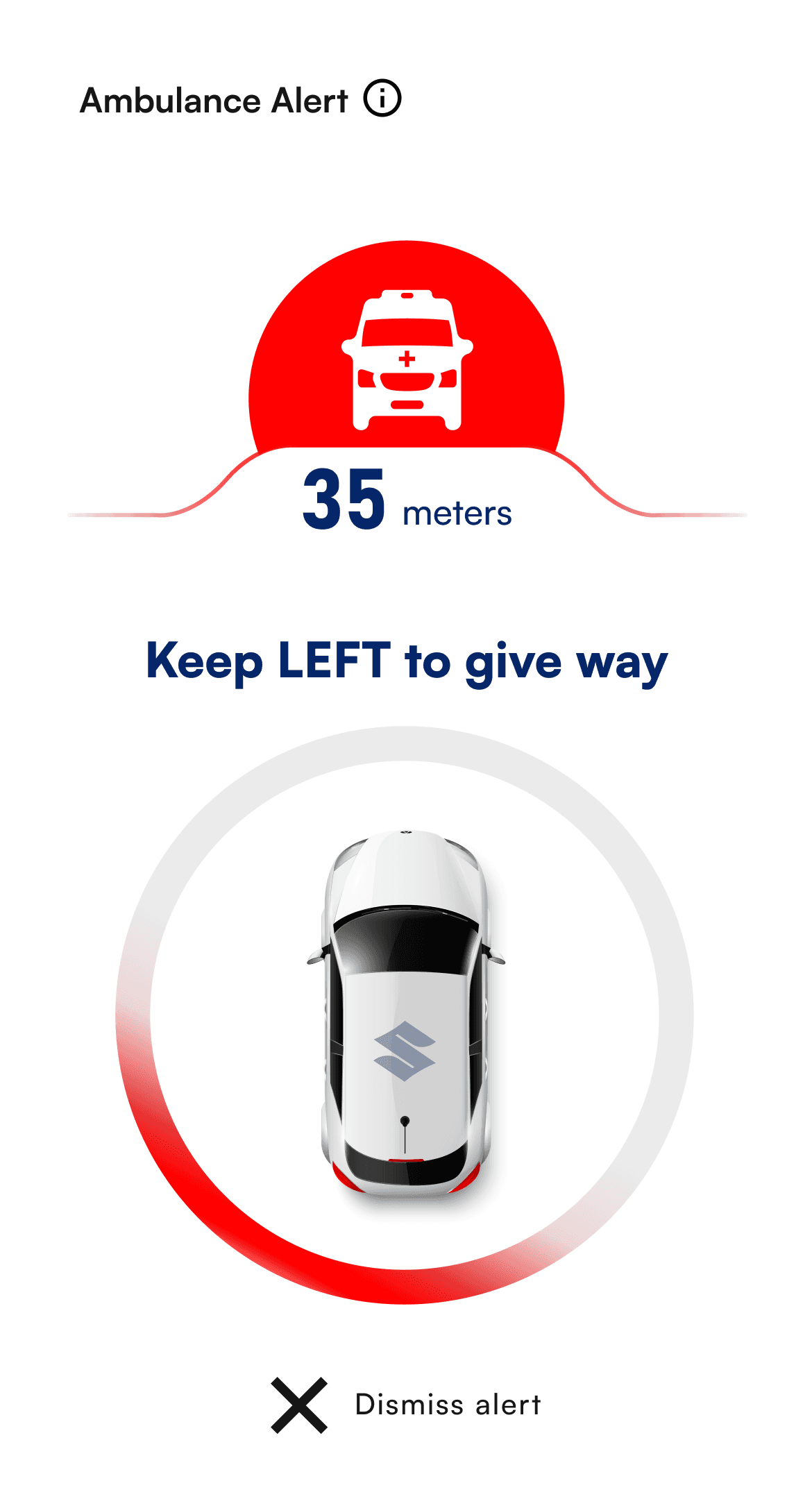
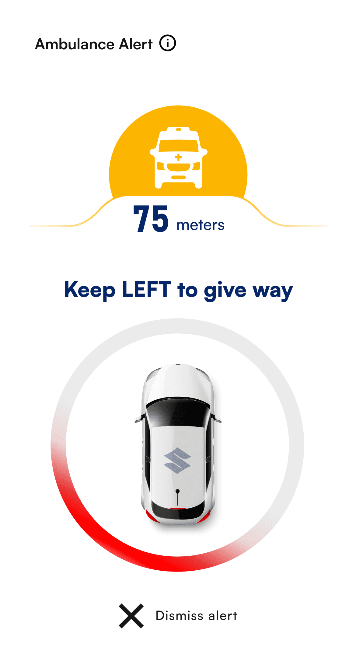
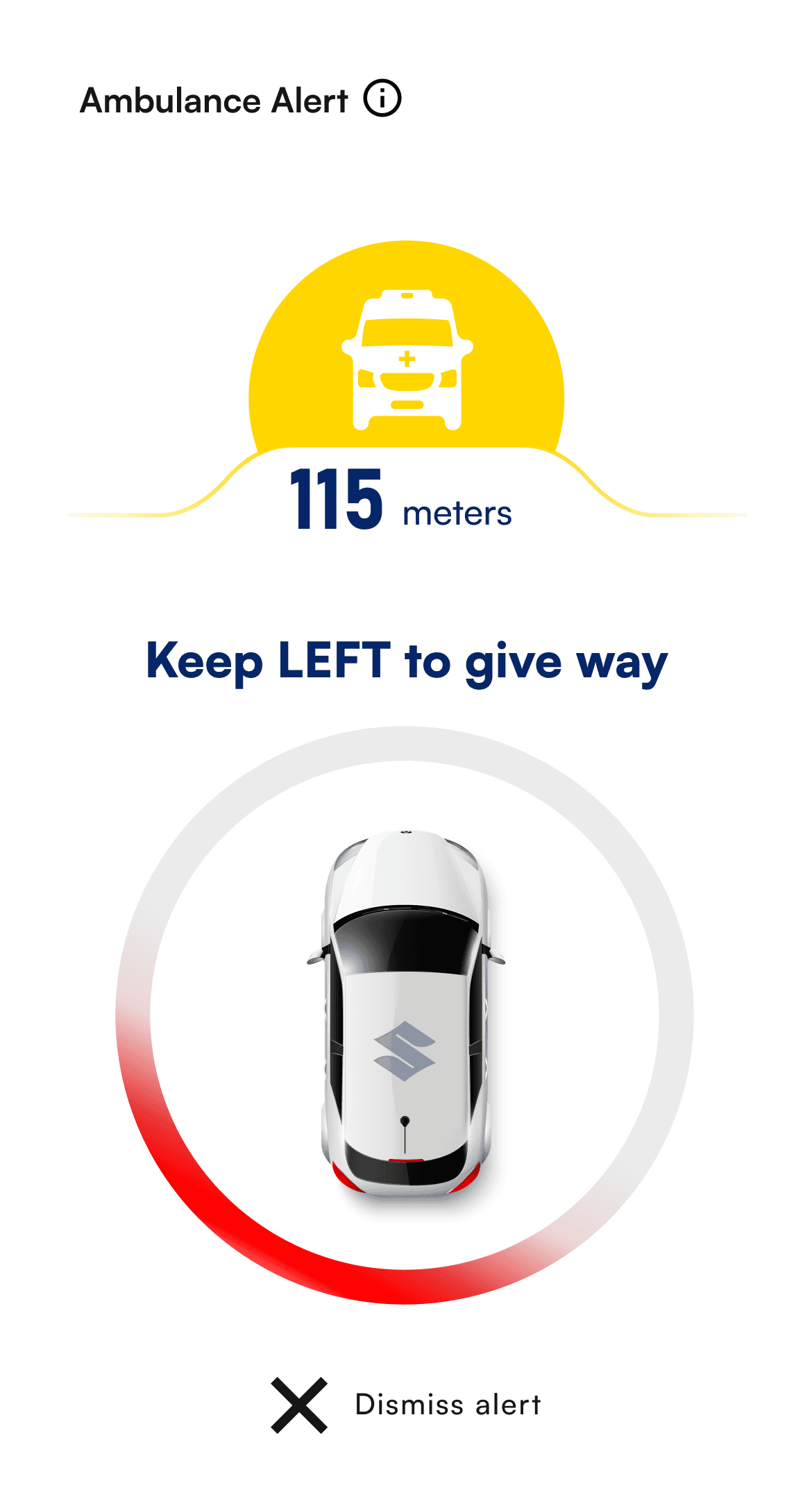
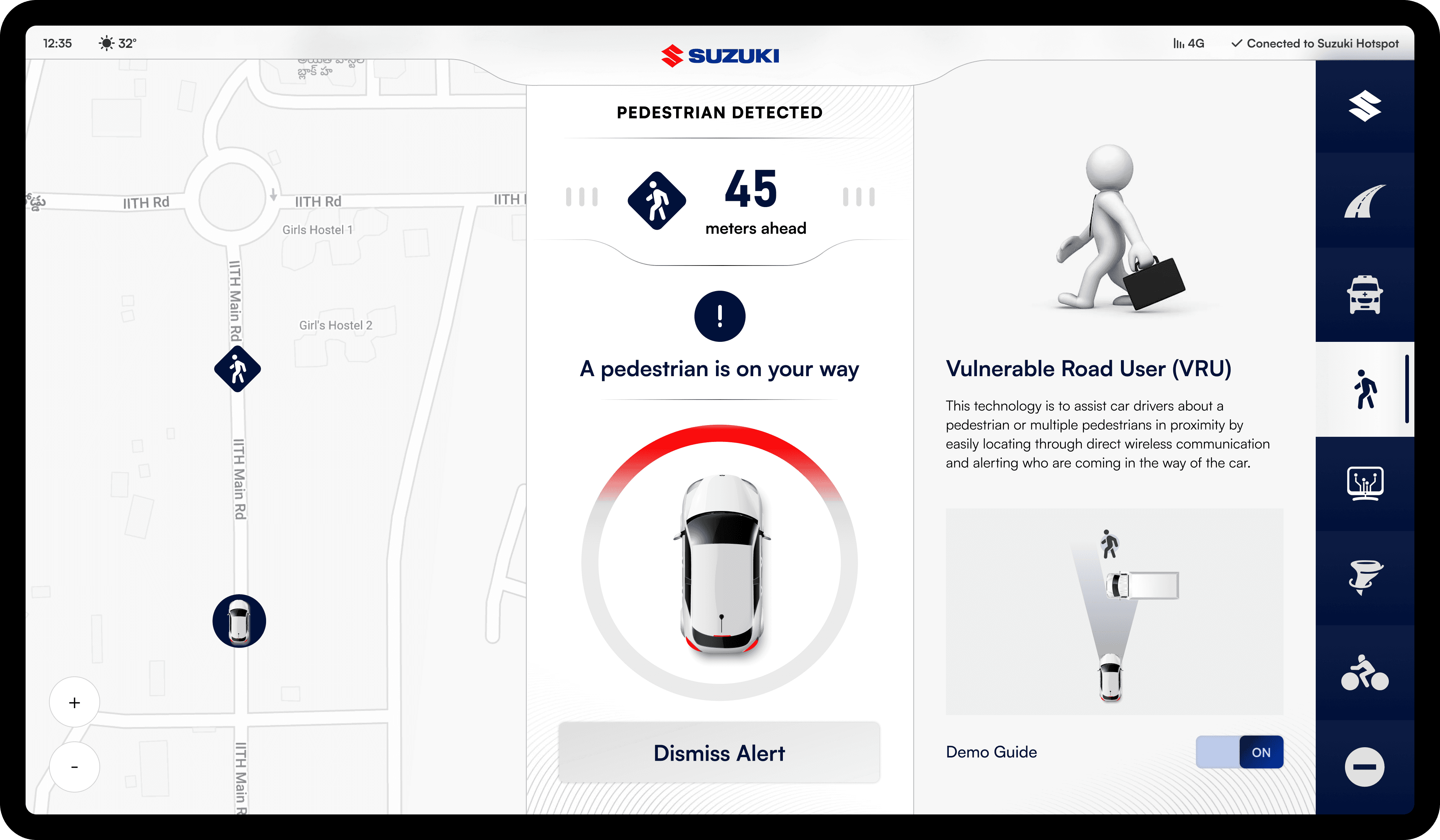
As a vehicle approaches, the distance indicator dynamically updates—turning red as it gets closer. The three lines also change to red, signaling urgency and helping drivers react swiftly.

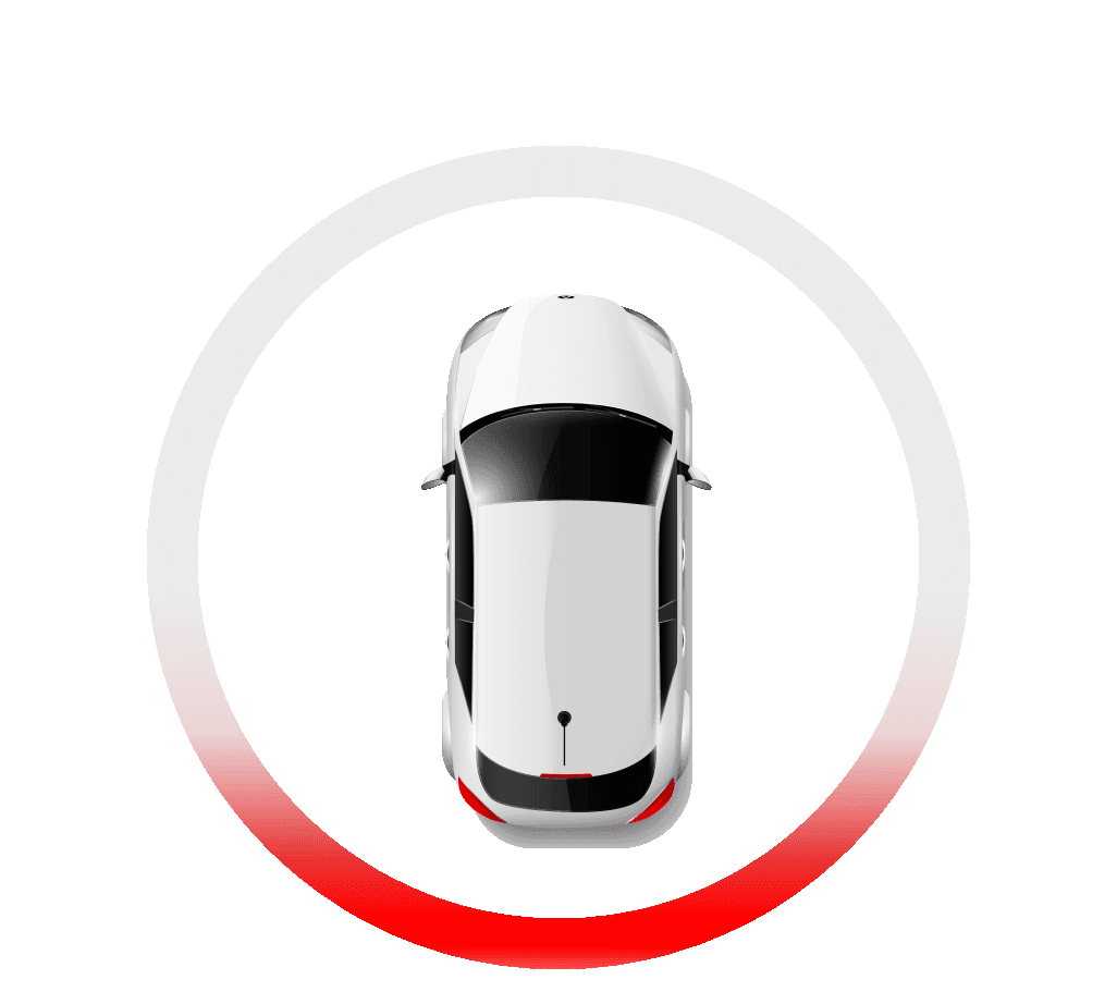
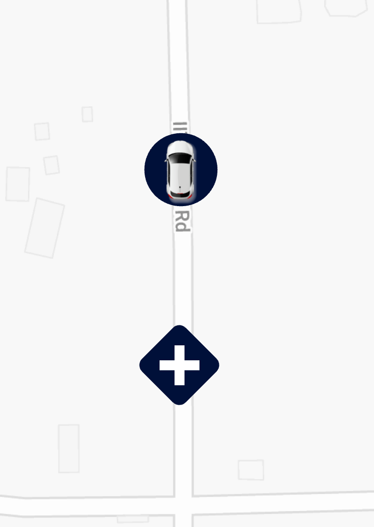
The red arc indicates the direction of an approaching vehicle. As the vehicle moves, the red highlight shifts around the circle, helping drivers quickly identify its location
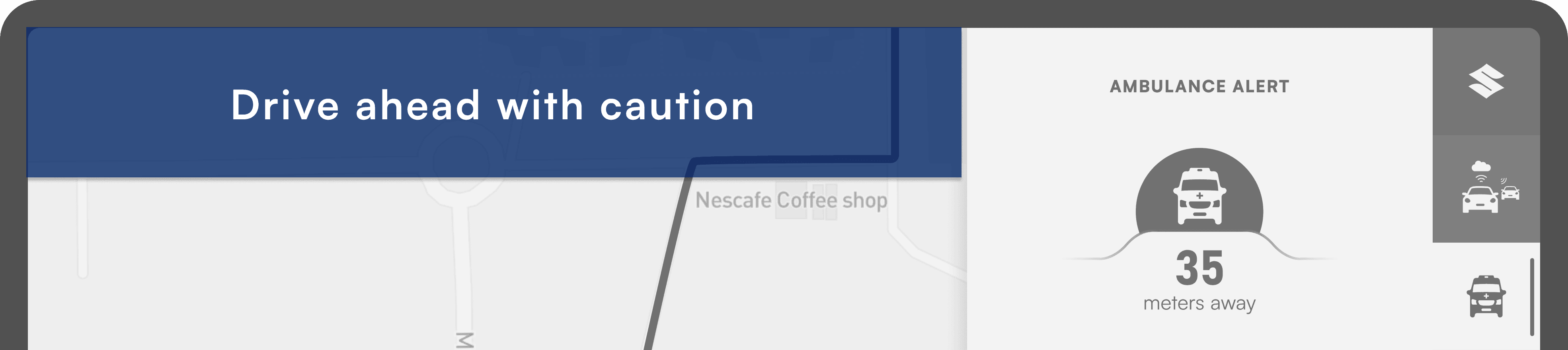
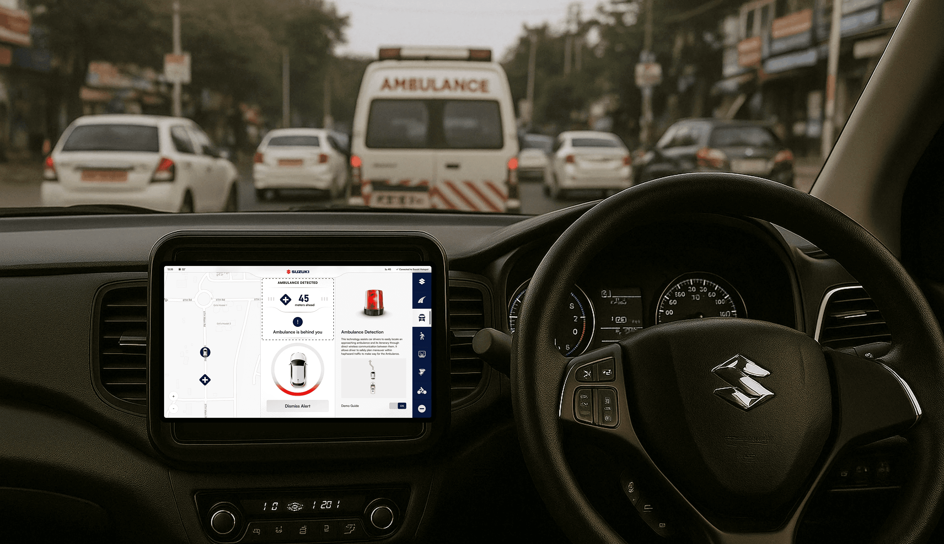
An ambulance approaches the car—this shows how it appears on the driver’s screen.
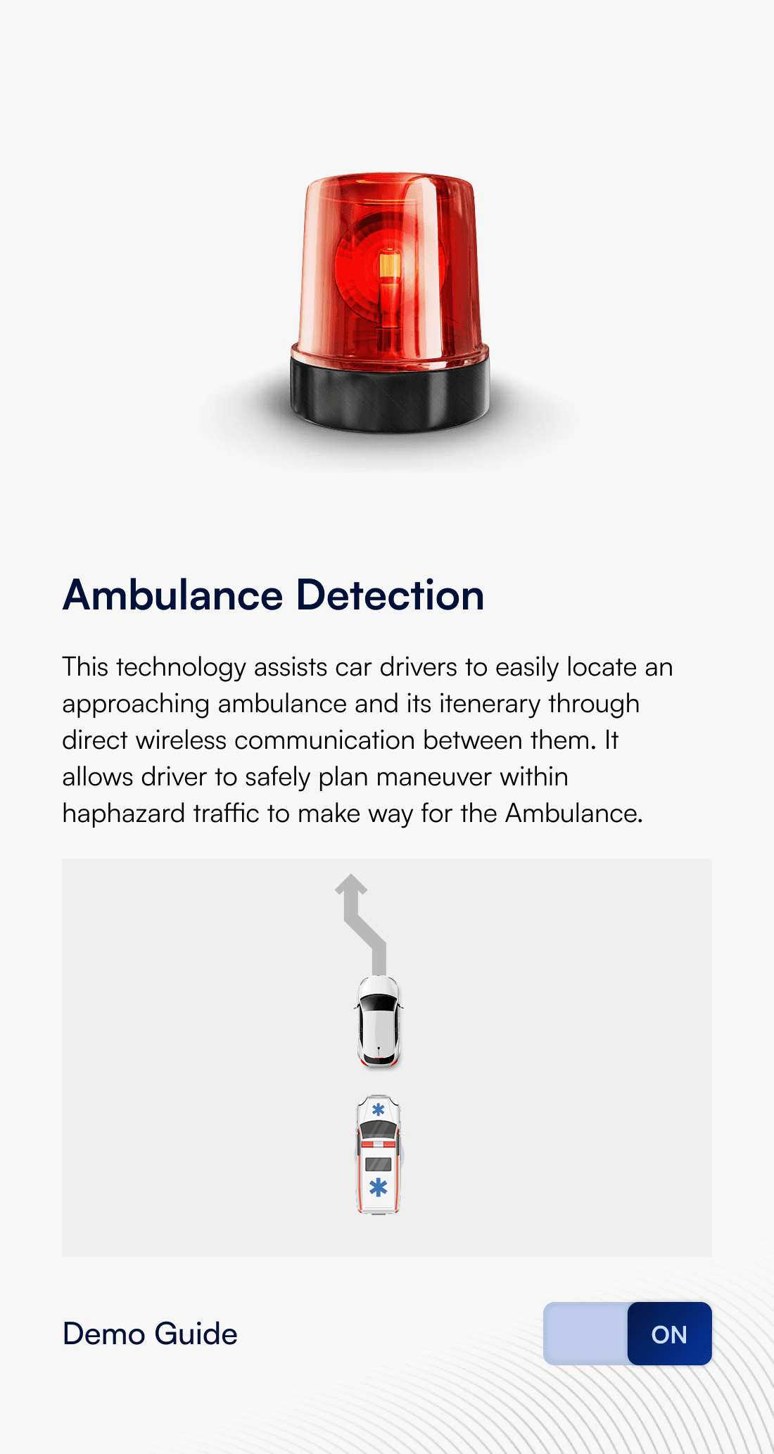

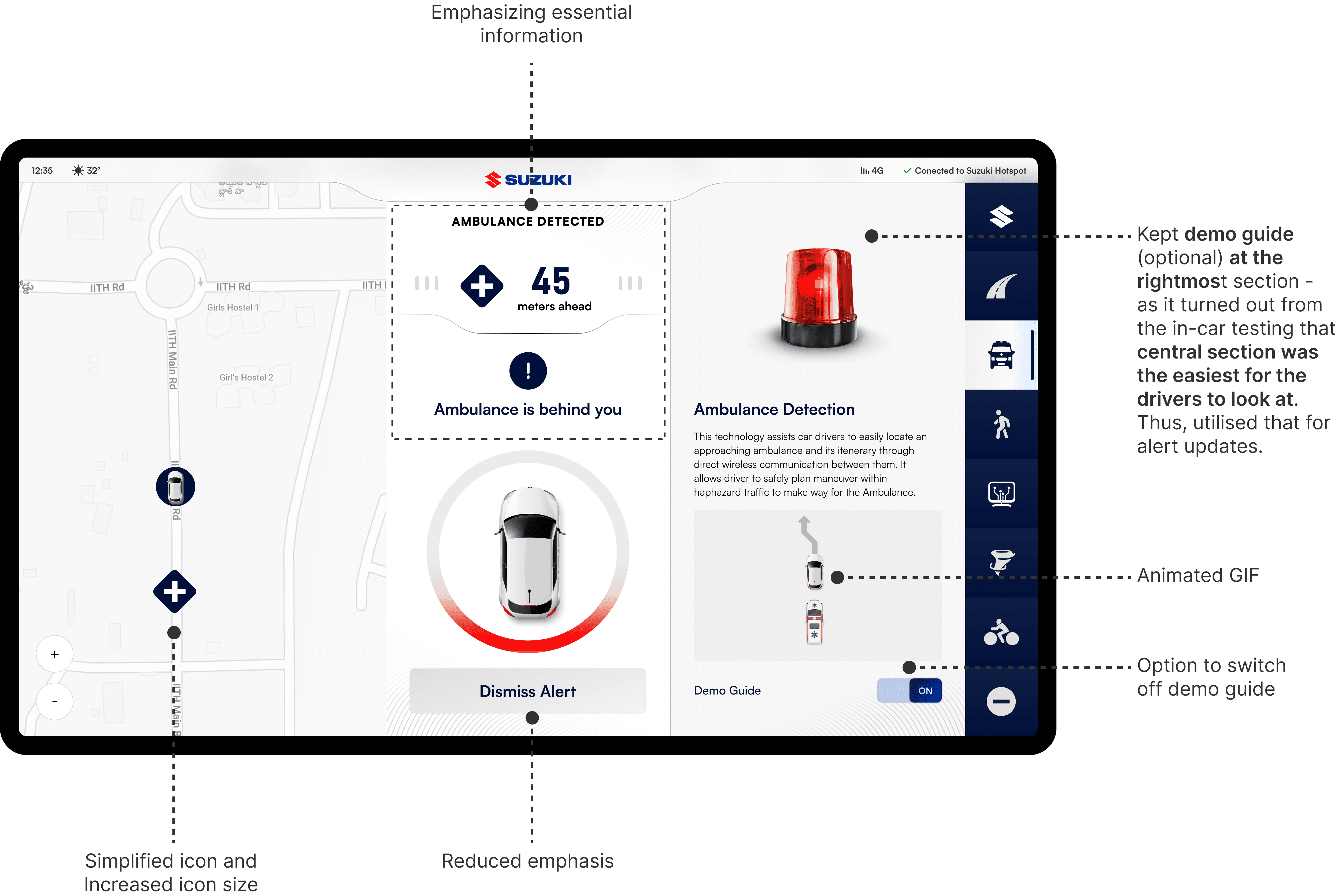
Drivers can choose to turn the demo guide on for assistance or switch it off if they find it distracting while driving.
Context
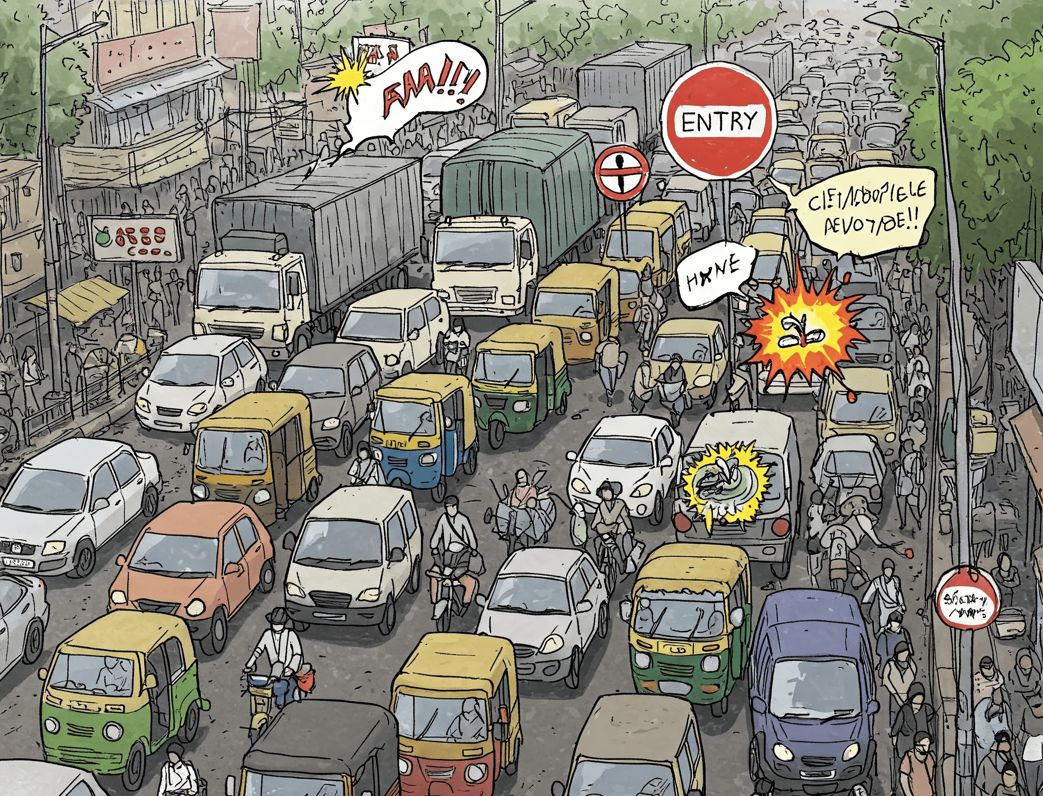
Imagine you are on a busy street in India. Bikes zip through narrow gaps, cars inch forward and pedestrians navigate with a mix of caution and boldness. Trucks might unload cargo right in the middle of the road and some drivers? Well, they are heading the wrong way. Amid this organized chaos, Suzuki’s V2X (Vehicle to Everything) technology promises a smoother, safer journey.
Before diving into design, we teamed up with the Engineering and Research teams to understand the real-world scenarios these features needed to address.
Notifies drivers of an approaching emergency vehicle and its route via direct wireless communication, helping them safely clear the way.
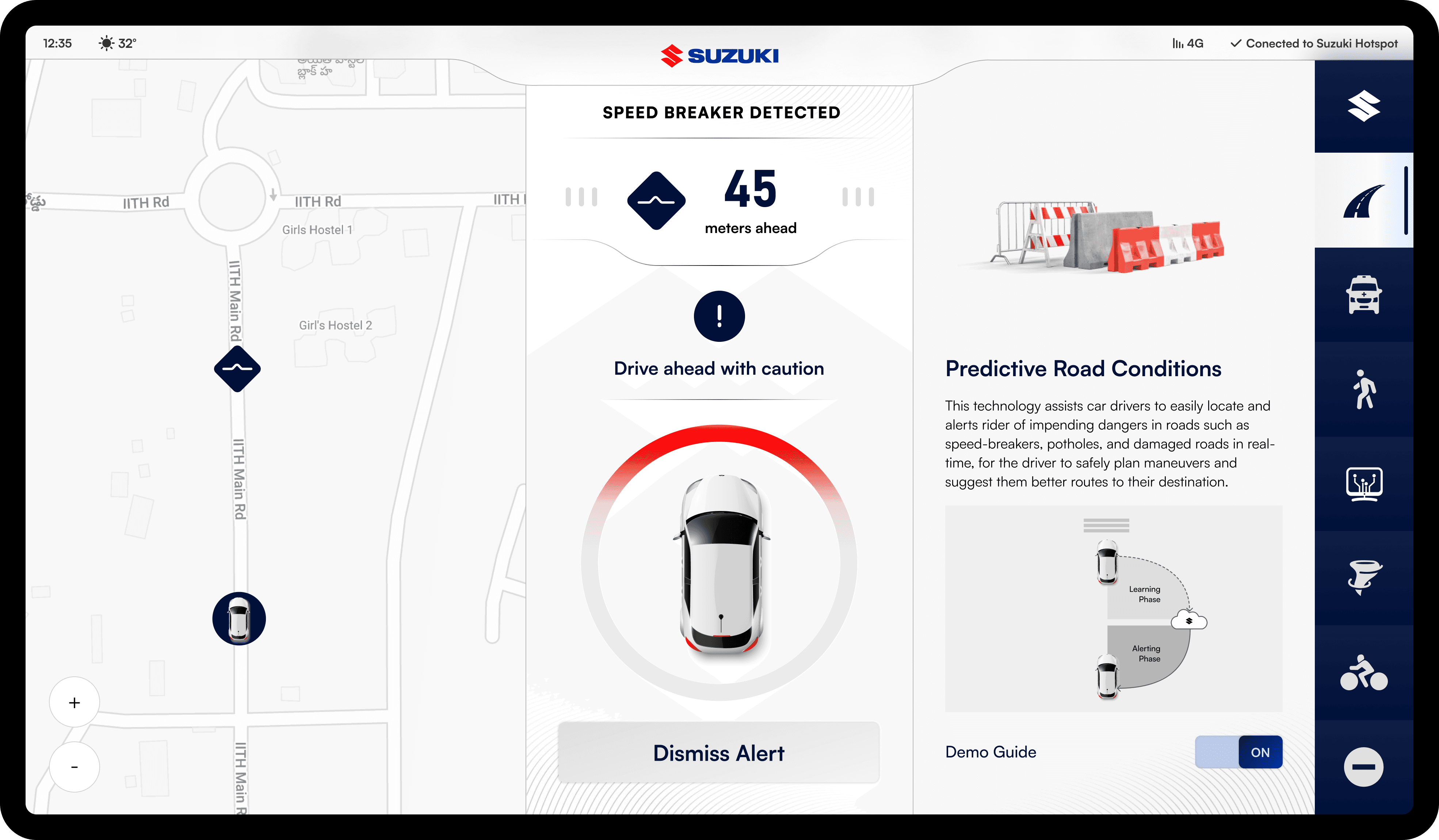
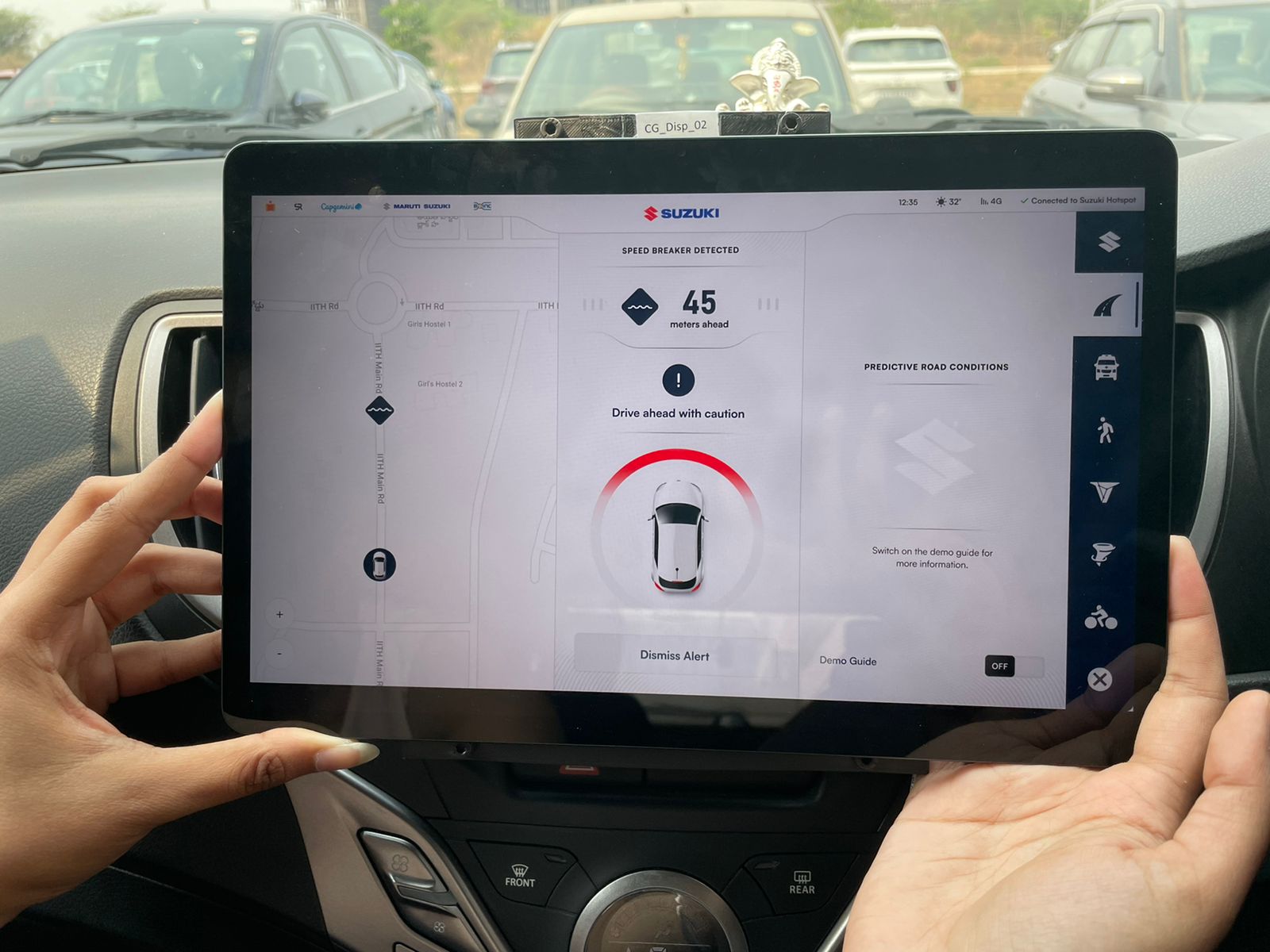
Aggregates real-time road data (potholes, speed breakers, damage) from connected vehicles to warn drivers of potential hazards ahead.
Alerts drivers to fast-moving two-wheelers that may cross their path, reducing the risk of sudden collisions.
Pre-warns drivers about an oncoming vehicle moving in the wrong direction, while also alerting the wrong-way driver to correct course.
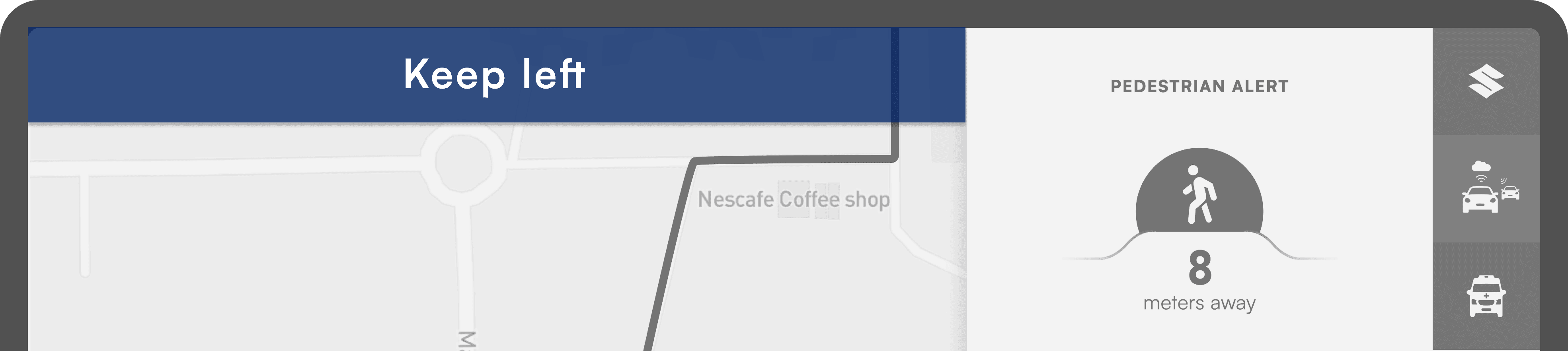
Warns drivers about nearby pedestrians who may enter their path, enabling timely corrective action to prevent collisions.
Allows car owners to share idle computing power for large-scale scientific research when the vehicle is not in use.
The Challenge
V2X (Vehicle to Everything) is powerful - it lets vehicles talk to their surroundings, enhancing safety and efficiency. But how do you show something so complex without overwhelming drivers? How do you make them trust a system they can’t see working?
Research and Discovery
V2X (Vehicle to Everything) is powerful - it lets vehicles talk to their surroundings, enhancing safety and efficiency. But how do you show something so complex without overwhelming drivers? How do you make them trust a system they can’t see working?

Following insights shaped the approach, ensuring V2X felt less like an intrusive gadget and more like an intuitive, reliable co-pilot.
Drivers don’t care about fancy tech. They just want clear, actionable alerts. No jargon, no distractions, just the right information at the right time.
Too many notifications? Drivers ignore them. If alerts aren’t accurate and timely, they become background noise - defeating their purpose.
Drivers don’t want to learn a new system. V2X alerts should integrate seamlessly into their existing driving habits, enhancing safety without adding complexity.
Goals
🟡 🟦 🛑
Distinguishable Alerts
Alerts should be visually distinct from each other, enabling drivers to understand them at a glance - without constant screen attention.
🔊
Audio Cues
A visual alert alone is not enough. Complementing it with an audio cue ensures drivers receive critical information even when they’re focused on the road.
🎯
Clutter-Free UI
The interface should be clean and minimal, highlighting only the most important elements - no unnecessary distractions.
✅
Explicit Call-to-Action
Drivers don’t have time for guesswork. The system must provide clear, actionable instructions on how to respond to each alert.
Design Iterations
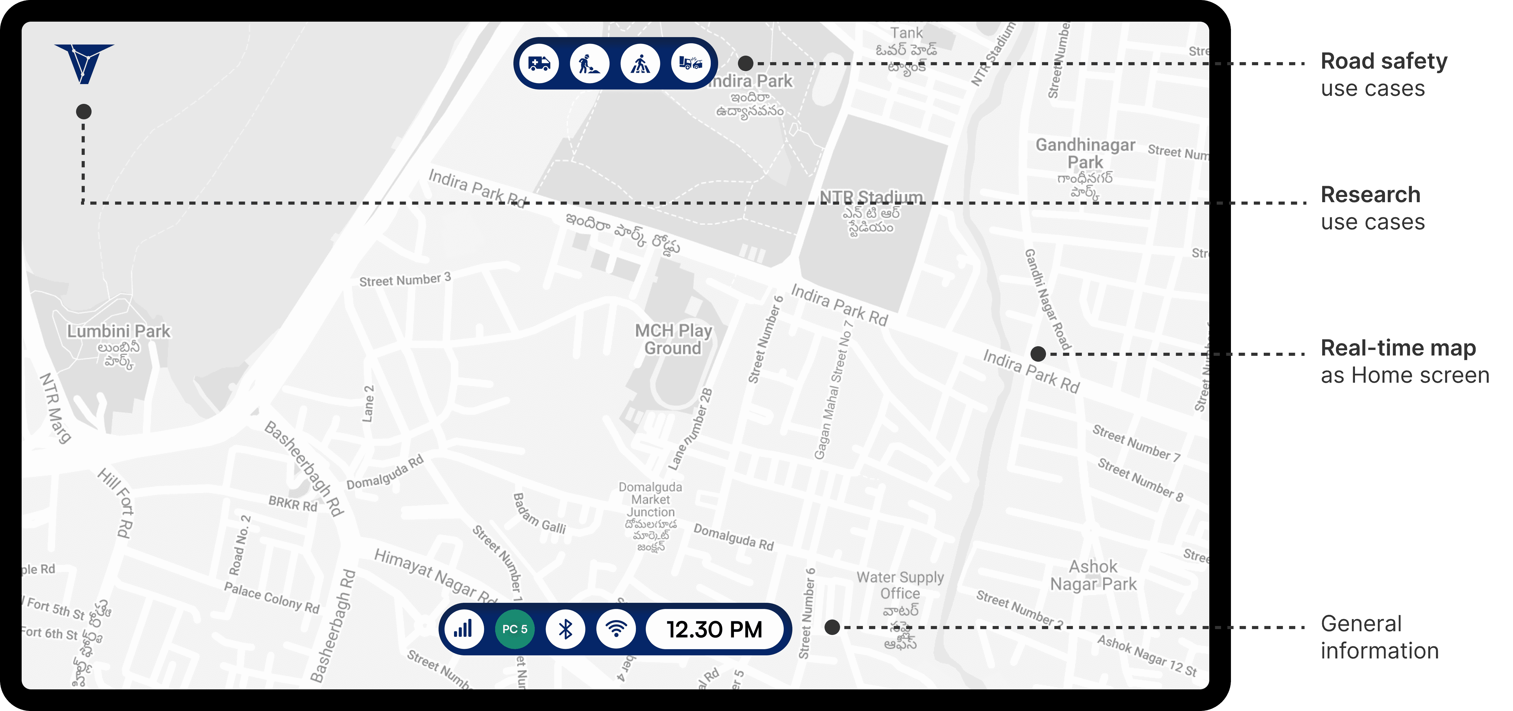
The information was arranged based on its importance, which ultimately shaped the way the UI was designed.
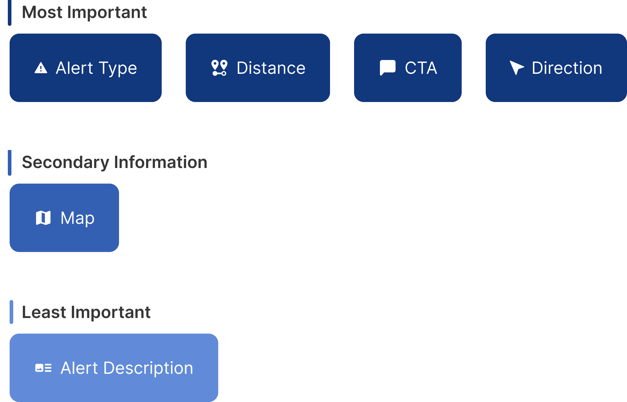
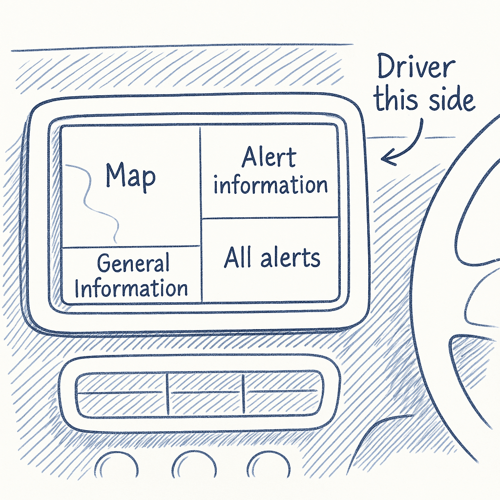
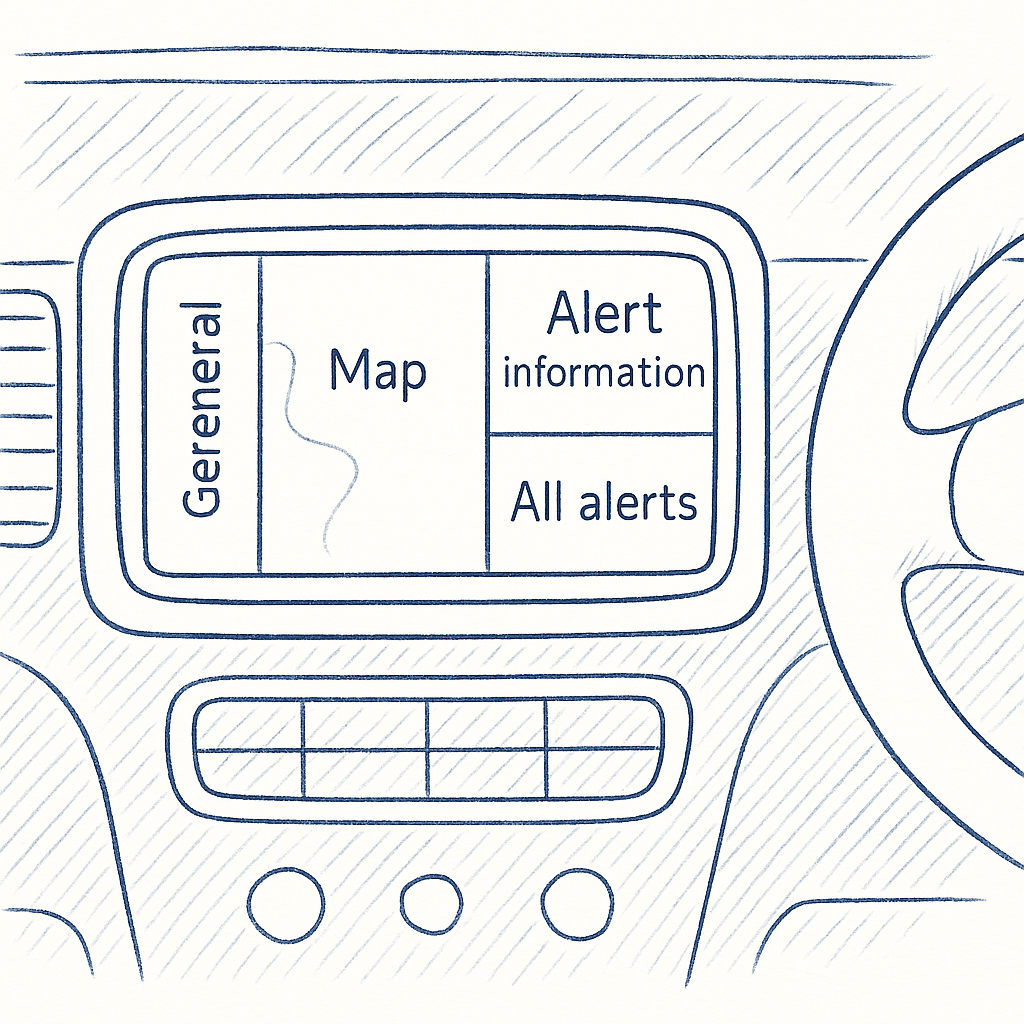
The layout for the Car HMI was planned based on the information hierarchy, with key info placed on the right for better visibility from the right-hand driver’s seat.
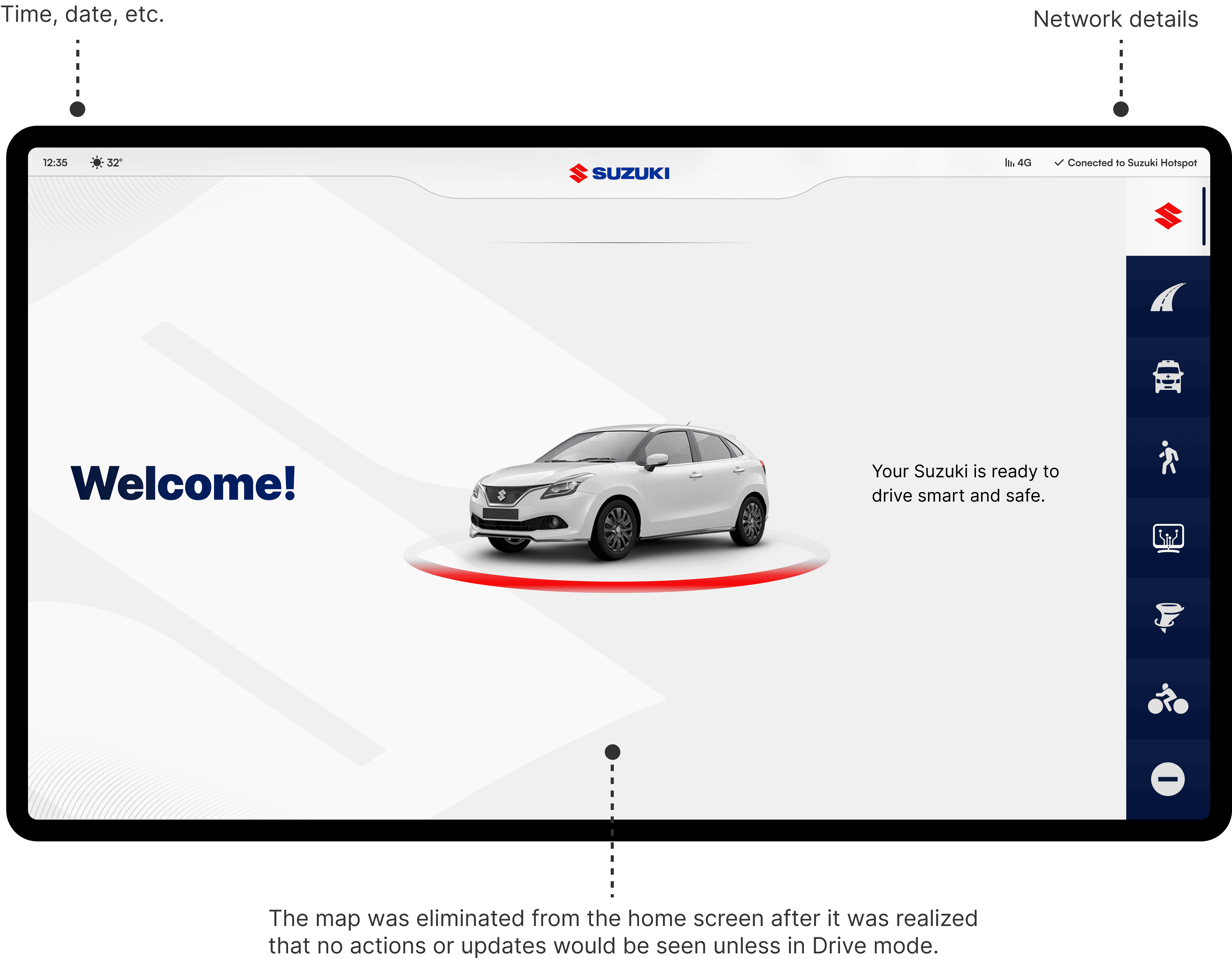
Home Screen
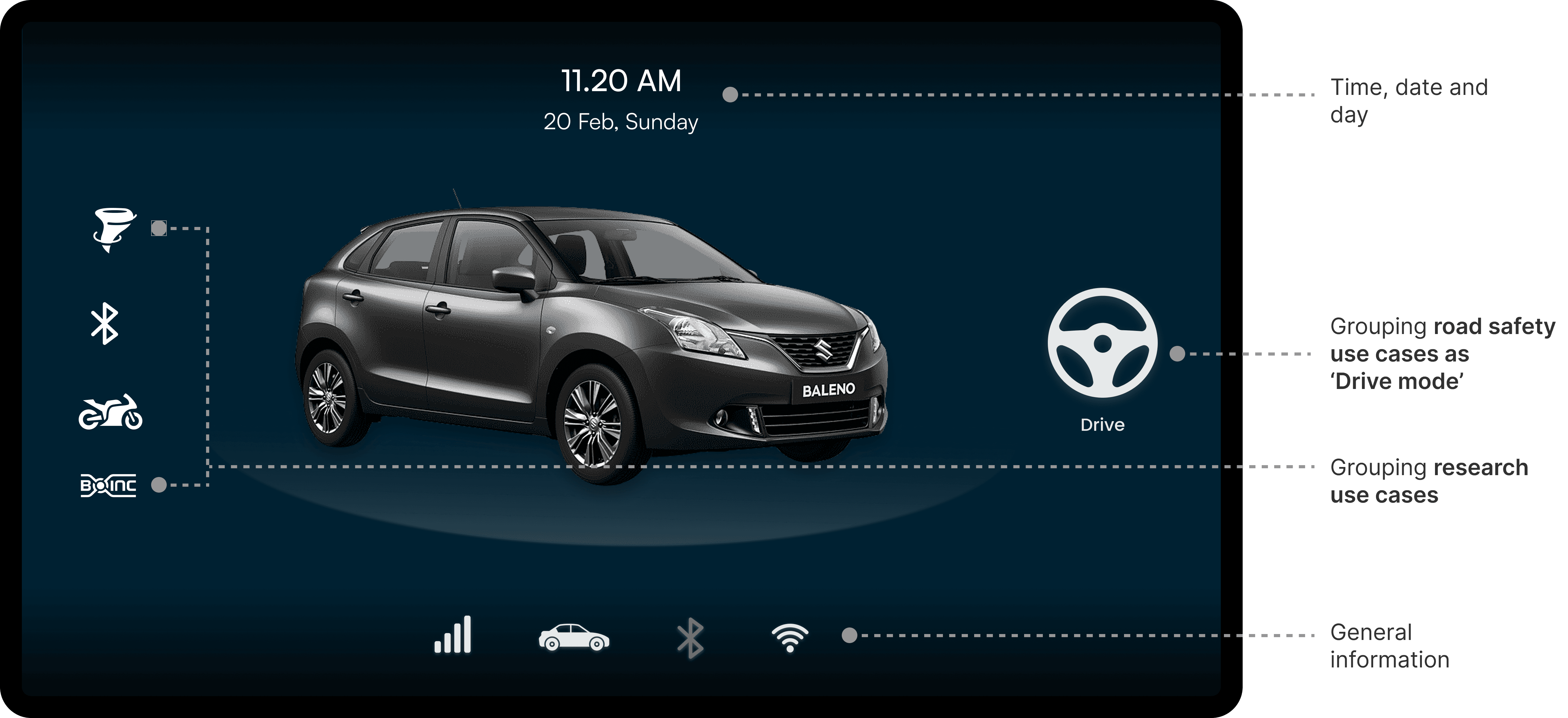
ITERATION 1: These two radically different ideas were explored in terms of both layout and color theme.
✅ What worked
Clear visual focus: Centered car model creates an instant connection with the driving context.
Neat grouping: Features are grouped logically—like Drive Mode and Research Use Cases.
⛔️ What could be better
Drive button is easy to miss: It blends into the layout—could be more prominent.
Icons lack labels: Not all icons are self-explanatory (e.g., weather alert).
ITERATION 2
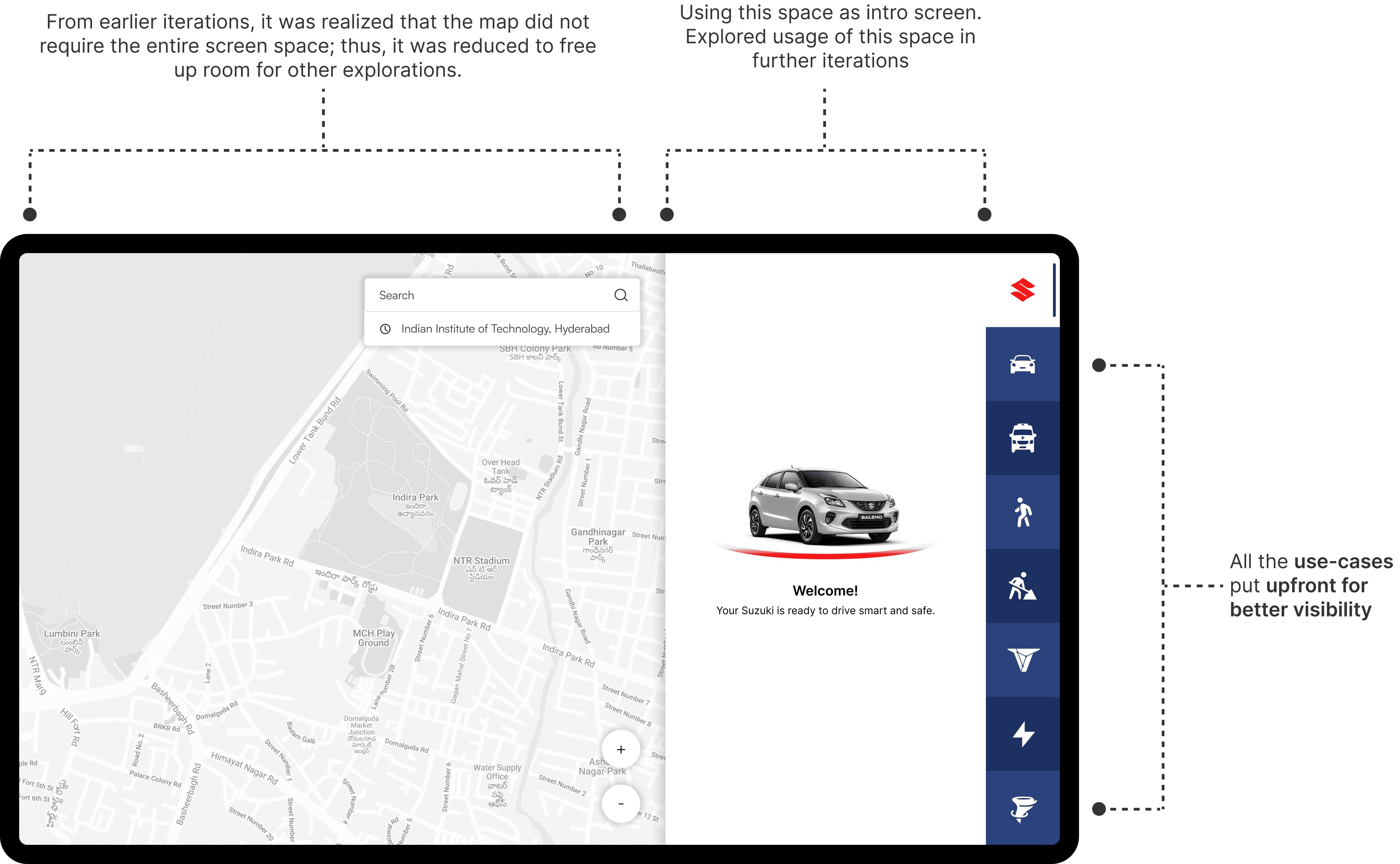
This layout was a key step forward, reducing the map freed up space, which was used to explore an intro screen and surface key use-cases that shaped the final design.
ITERATION 3: Final layout
ITERATION 1
✅ What worked
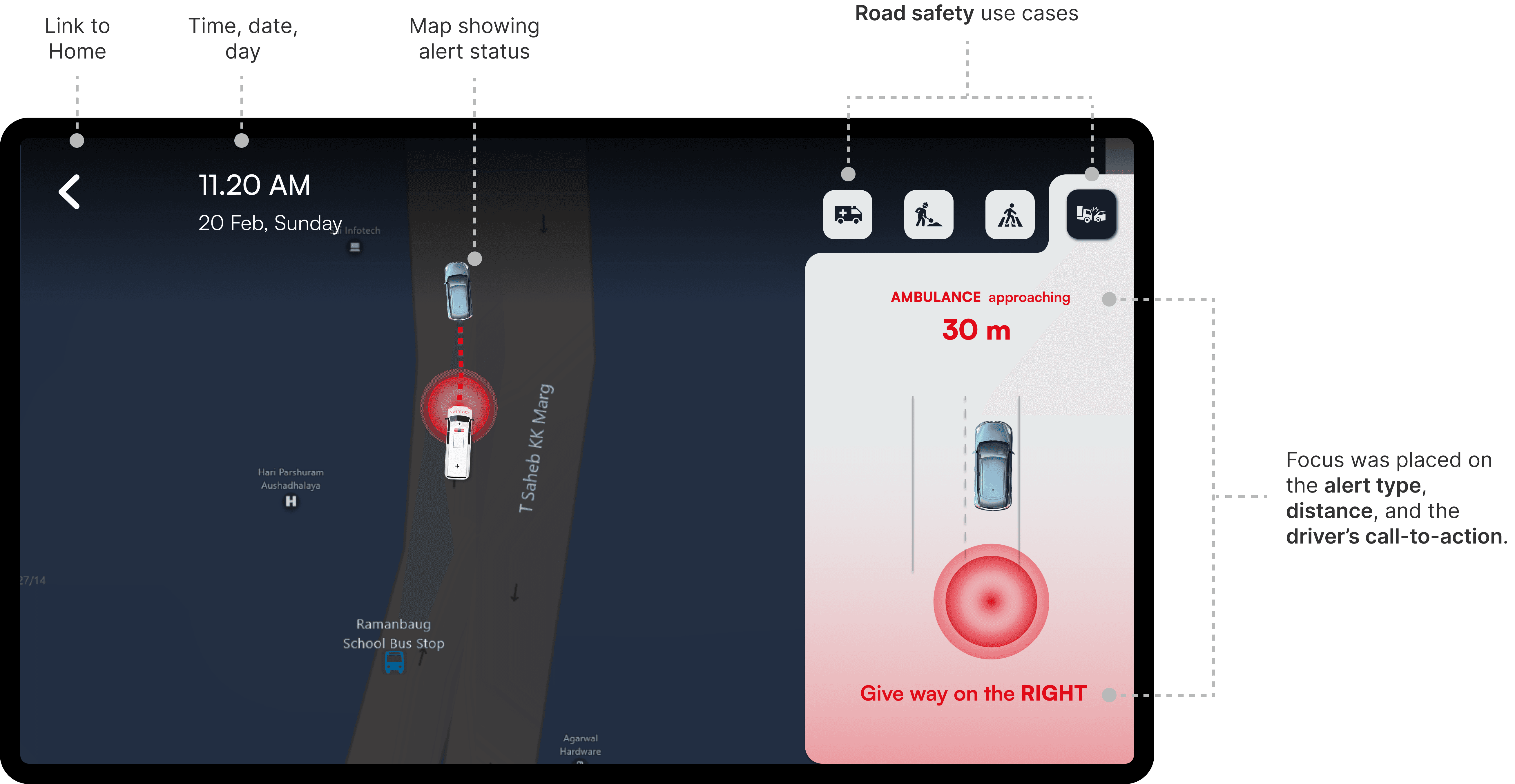
Clear, prioritized alert info: The alert type, distance, and driver action are prominently displayed—no guesswork.
Visual reinforcement with map: The live map with visual tracking helps the driver anticipate the vehicle's position in real time.
High contrast and readability: Bold use of red and white immediately draws attention to critical alerts.
⛔️ What could be better
CTA placement could be more prominent: "Give way on the RIGHT" might benefit from increased size or styling for better visibility under stress.
Icon buttons (Use cases) are secondary: The icons at the top right are small and might not be noticed or interacted with during driving.
ITERATION 2
✅ What worked
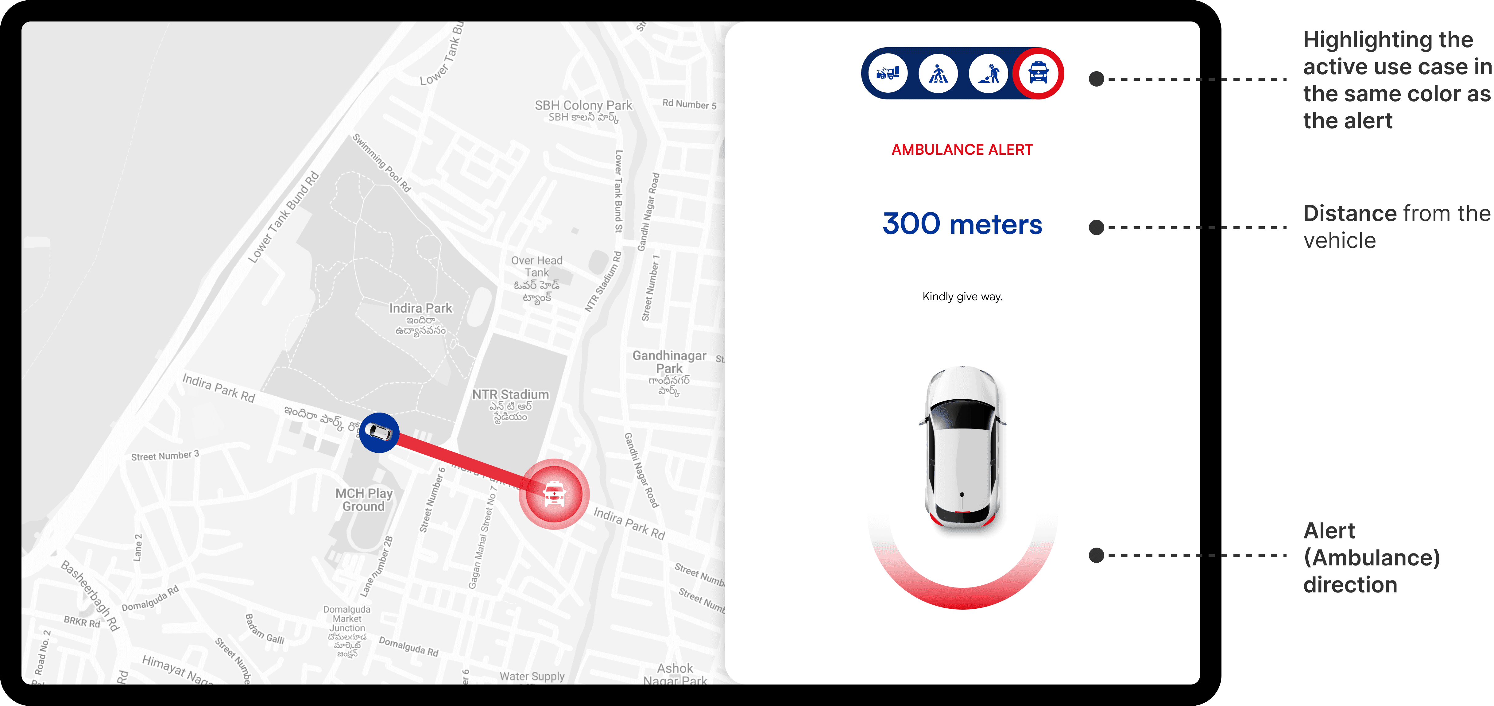
Optimized for real-world conditions: From in-car testing, it became evident that a light UI theme performed better under high sun-load. As a result, a light theme was adopted for improved visibility.
Color usage: The active use-case icon is highlighted using the same alert color, aiding quick recognition.
⛔️ What could be better
Call-to-action styling: The instruction "Kindly give way" could be made bolder or more visually prominent.
Low emphasis on use Case icons: The small icons at the top may not stand out during quick glances while driving.
ITERATION 3
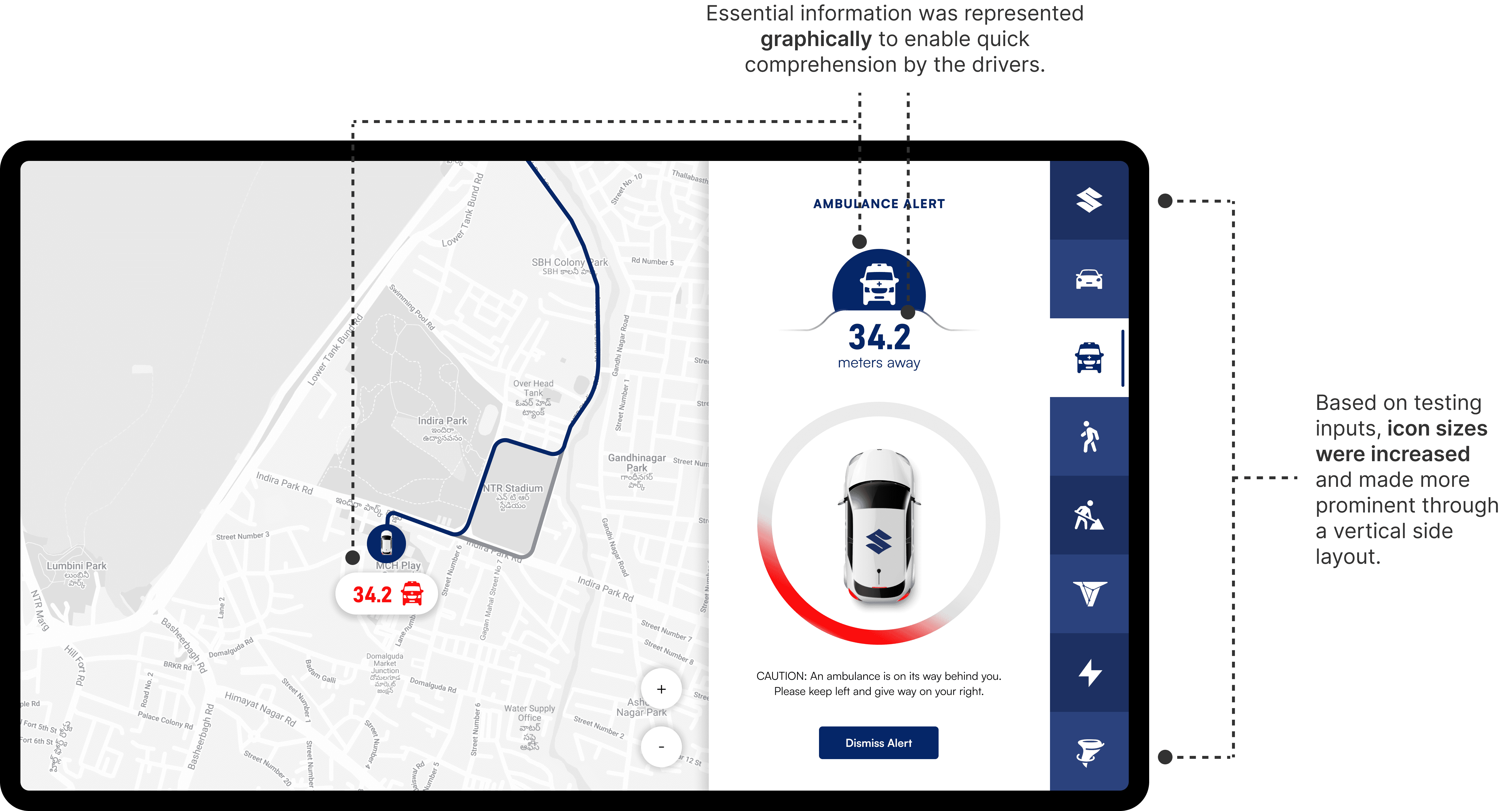
This layout marked the near-final direction for the alert screen. With the overall structure in place, I shifted focus toward refining critical elements like the call-to-action (CTA), ensuring it was informative without being overly attention-grabbing or dismissible too quickly.
Call-To-Action (CTA): The CTA was placed at the top of the screen to give the driver explicit, glanceable instructions on how to respond to the alert. The goal was to keep the message highly visible without interrupting the driving experience.
⛔️ What could be better
While the CTA was visually prominent, its position on the far left made it easy to miss—especially for drivers focused on the live map or the distance indicator, as revealed during testing.
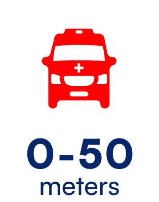
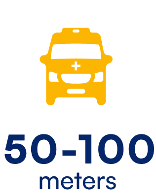
Alerts: Color coding was introduced to visually communicate the urgency of an alert—red indicating immediate action, yellow for lower priority. The aim was to help drivers quickly assess the seriousness of a situation at a glance.
⛔️ What did not work
during in-car testing, it was discovered that the intended contrast was less effective under strong sunlight, leading to further refinements in our visual strategy.
Final Designs
Ambulance alert
Road condition alert
Pedestrian alert
Reflection
This journey proved that trust and simplicity matter as much as functionality. A feature can be packed with tech, but if it’s not intuitive and reliable, it’s just another distraction. By focusing on empathy and testing, we built an experience that feels as natural as turning the ignition—even in India’s driving chaos.
Designing for a car HMI was uncharted territory. New constraints, new user behaviors—it felt overwhelming. But diving into research and applying core design principles helped me ramp up quickly.
Presenting to a large, cross-functional team was daunting. But I realized collaborative feedback only makes designs stronger. The more I embraced it, the more confident I became in my decisions.
Growth happens outside your comfort zone. This project was proof.
Fresh perspectives unlock new ideas. Seek them often.
It saves time, avoids rework, and ensures feasibility.