

Mindtickle has a Sales Readiness Platform for onboarding, product training, coaching and ongoing readiness, that helps fast growing companies to prepare their sales teams.
My role
Team
Timeline
3 Weeks
Context
During a product audit, the Peers' page - a feature designed to display points for learners was evaluated. The findings revealed very low engagement, with only 5% monthly users. Simultaneously, customer feedback highlighted a strong demand for motivational features, such as a gamified leaderboard. This presented a perfect opportunity to address the usability issues and transform the page into a more engaging and impactful experience.
Impact
🎉 The new leaderboard was highly appreciated by users, leading to a significant surge in monthly engagement, with usage increasing to 50%.
Highlights
Leaderboard for Sales reps: See progress, engage with peers and take concrete steps to improve.


Problem
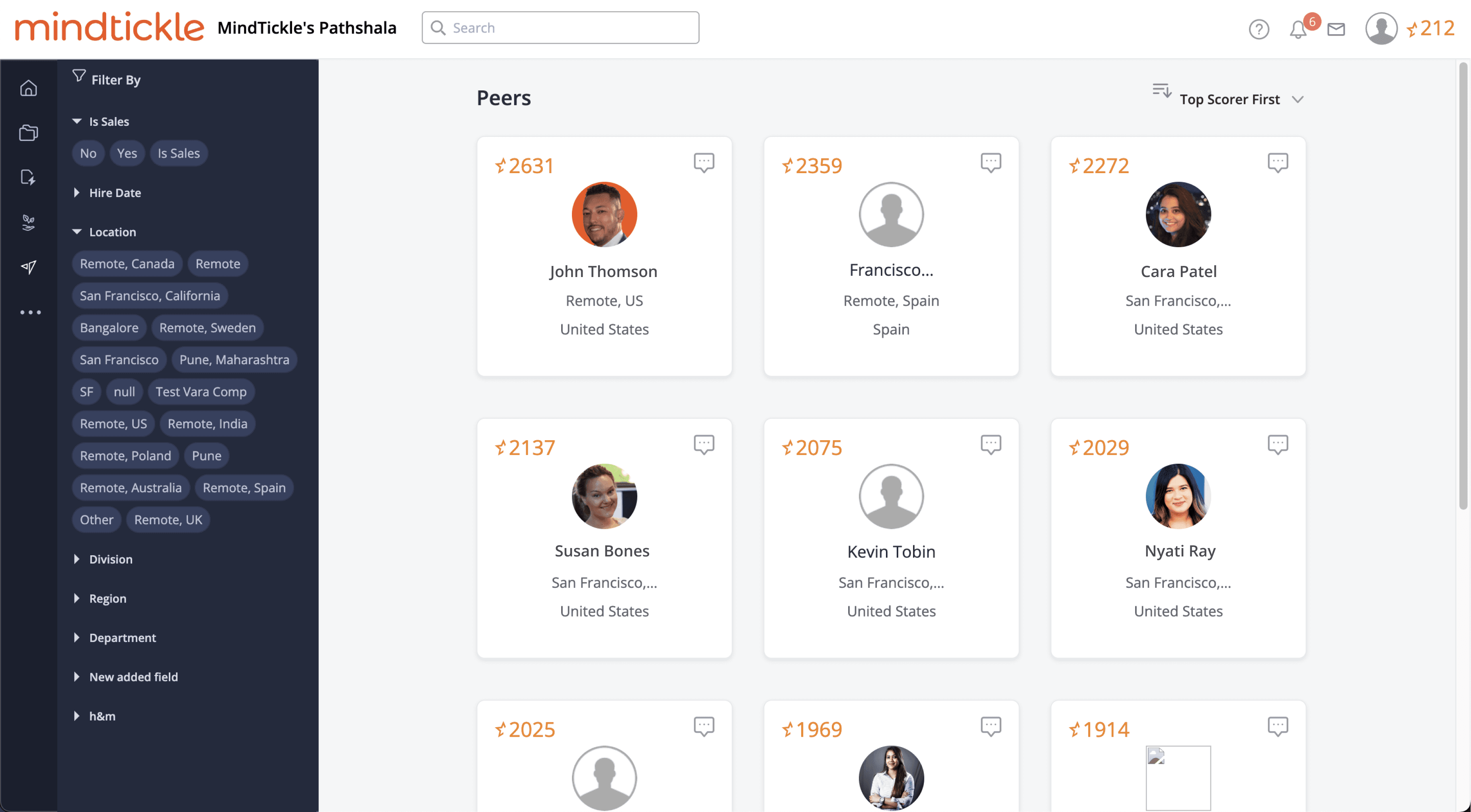
Once upon a time (okay, not that long ago), there was a ‘Peers’ page. It was supposed to help learners track their progress among colleagues.
The plot twist that me and the PM got to hear when we reached out to our sales reps for internal feedback.
And the data backed it up, loud and clear.
Thus, these are either unintentional visits or early drop-offs due to a lack of perceived value.
Meanwhile, some customers started asking for a company-wide leaderboard - a more engaging, gamified way to track learning progress. The tech stack was already being updated, which meant the Peers page would soon get a facelift anyway. So, why not take this opportunity to give learners something more meaningful?
Analysis

“Whoa! So many filter chips on the left, a sea of identical cards in the center, and a random chat pop-up asking me to type… what? I feel like I need a treasure map just to figure out where to click!”
- A confused user


⛔️ What could be better
No “Reset All” control means once multiple filters are applied, there’s no quick way to start over.
Lack of a search‐within‐filters input or “show more” grouping makes it hard to find specific criteria.
Unfriendly labels (like “null” or test fields) leak backend data and confuse learners.

⛔️ What could be better
No visual variation or emphasis. Top scorers and individual learners lack a visual hook to draw attention
No hover or focus state to indicate interactivity

⛔️ What could be better
Invisible chat history makes it feel like a one-off broadcast, not a conversation
No prompts or context to motivate learners to message peers

Ideation
Foundations
Leaderboards aren’t one-size-fits-all. In sales, they fuel cutthroat competition; in fitness, they spark personal bests; in learning, their job is to keep learners engaged.
At Mindtickle, we focused on motivating learners. Admins already had analytics, but learners needed a clear, rewarding view of their progress. Early discussions with PM aligned on vision and timelines, giving me the head-start we needed to dive into ideation.

Nudge

Motivation

Progress
Before diving into the designs, I fleshed out different concepts based on the key themes: Nudge, Motivation and Progress. These helped frame what kind of leaderboard experience would work best for our learners.
I discussed these ideas with the Readiness Experience Design team and used an idea matrix to evaluate them. At the end of the discussion, we voted on the most promising directions.


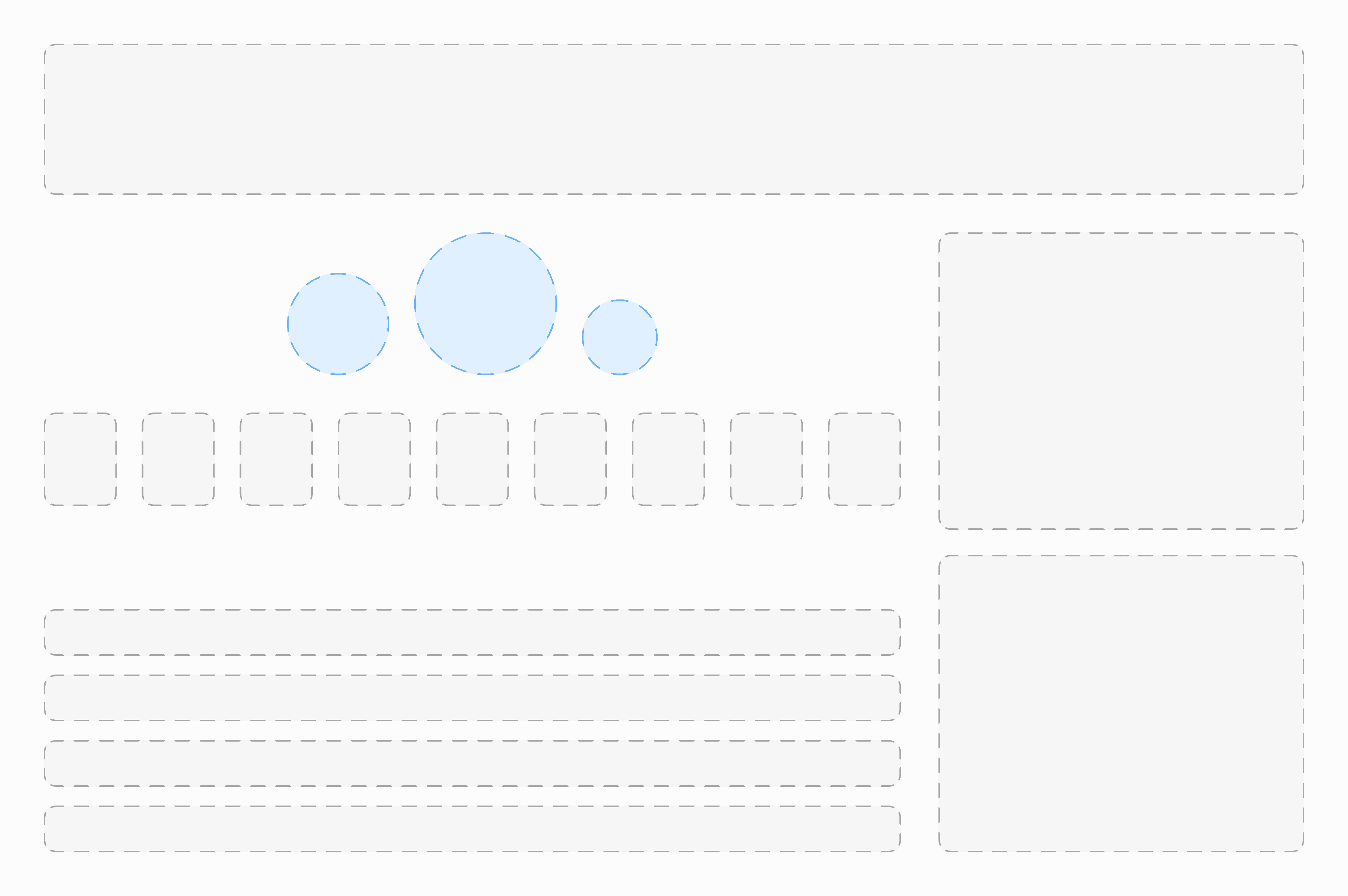
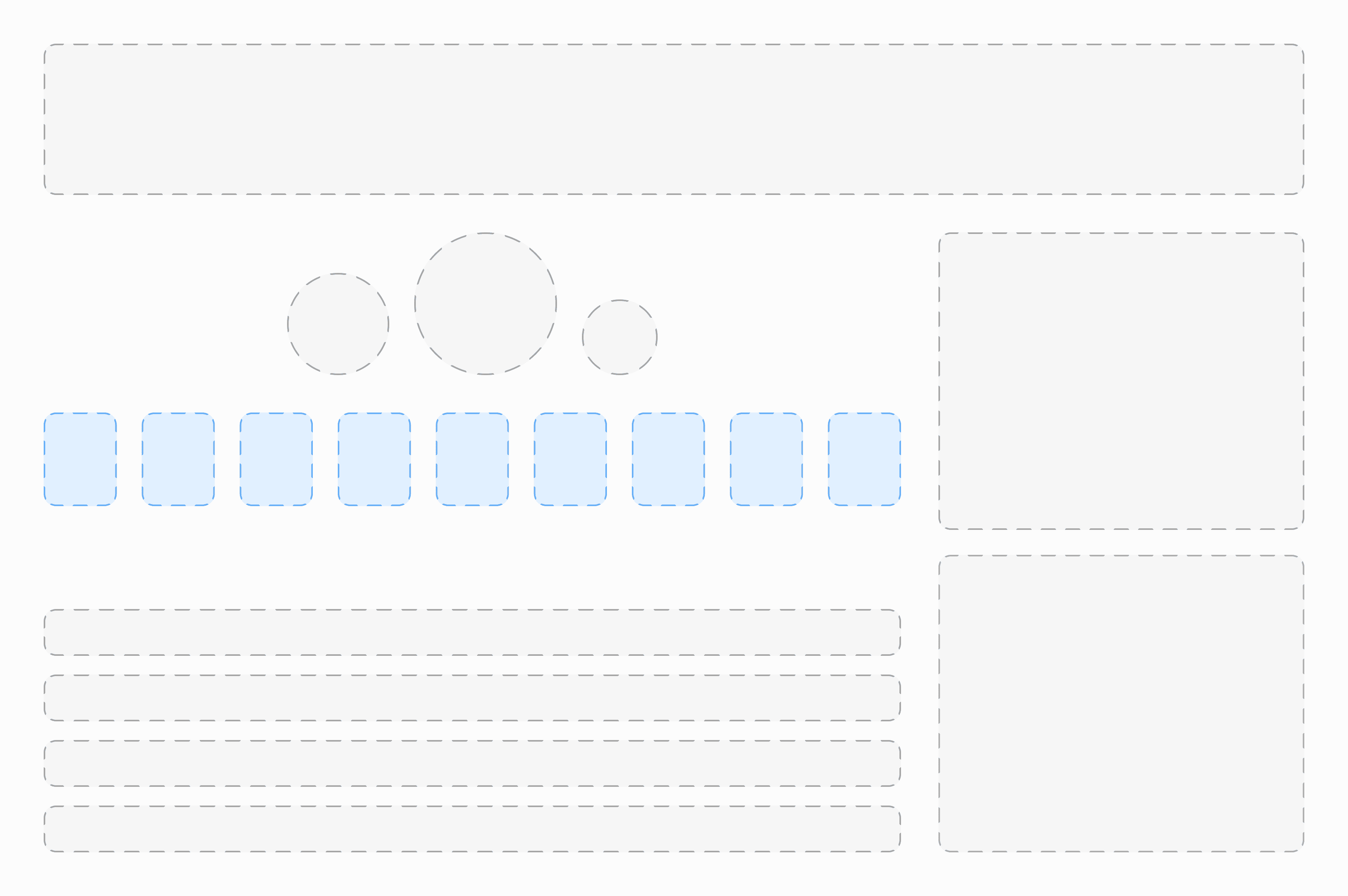
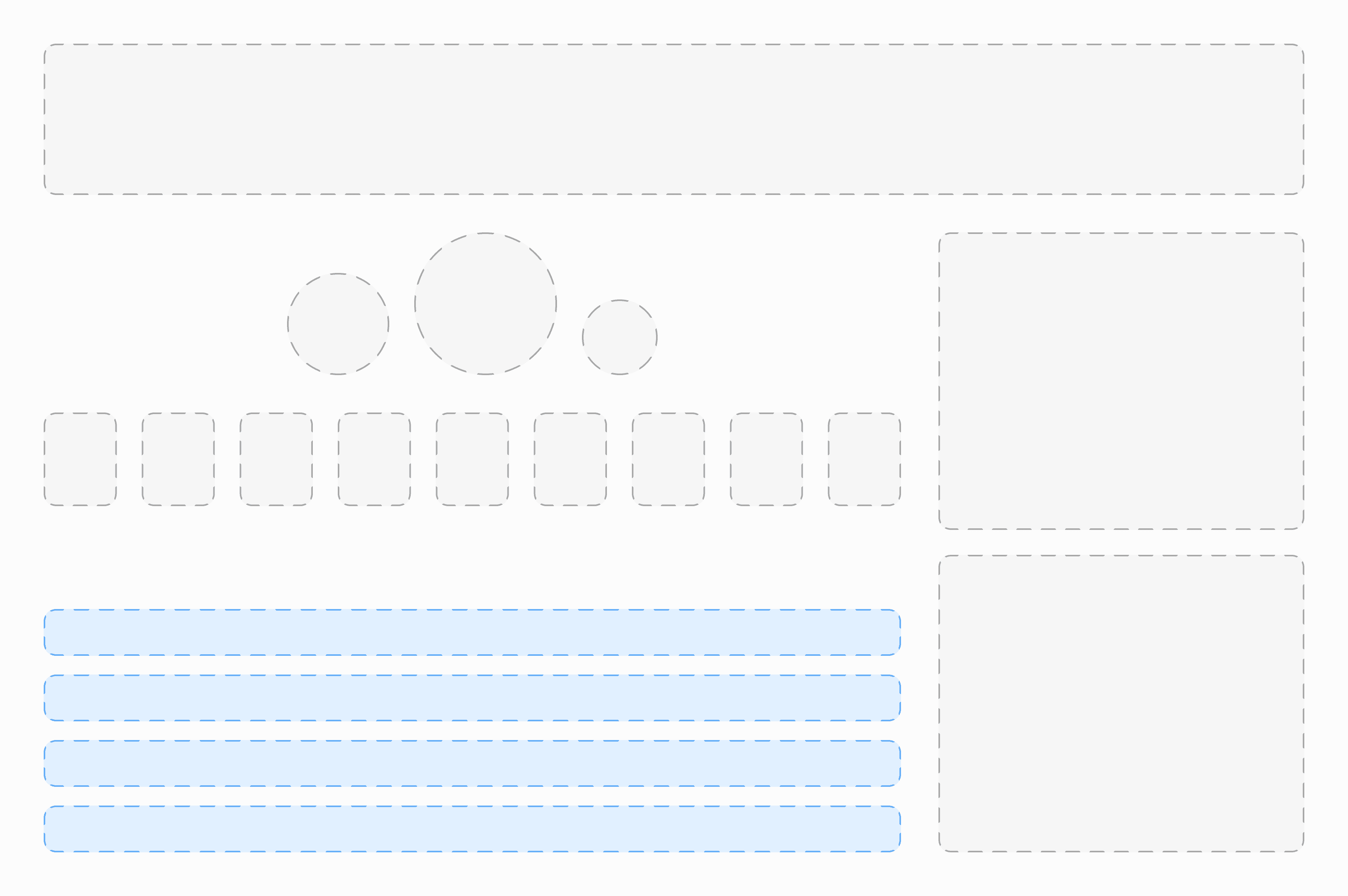
Early sketches
I sketched out low-fidelity layouts to pinpoint the core components of our leaderboard:
Page Header: Establishing context and messaging.
Podium & Rank-List: Highlighting top performers and remaining learners.
Filters & Tabs: Enabling Team, Department, and Global views.
Learner Profile & Nudge Notifications: Making progress personal and timely.
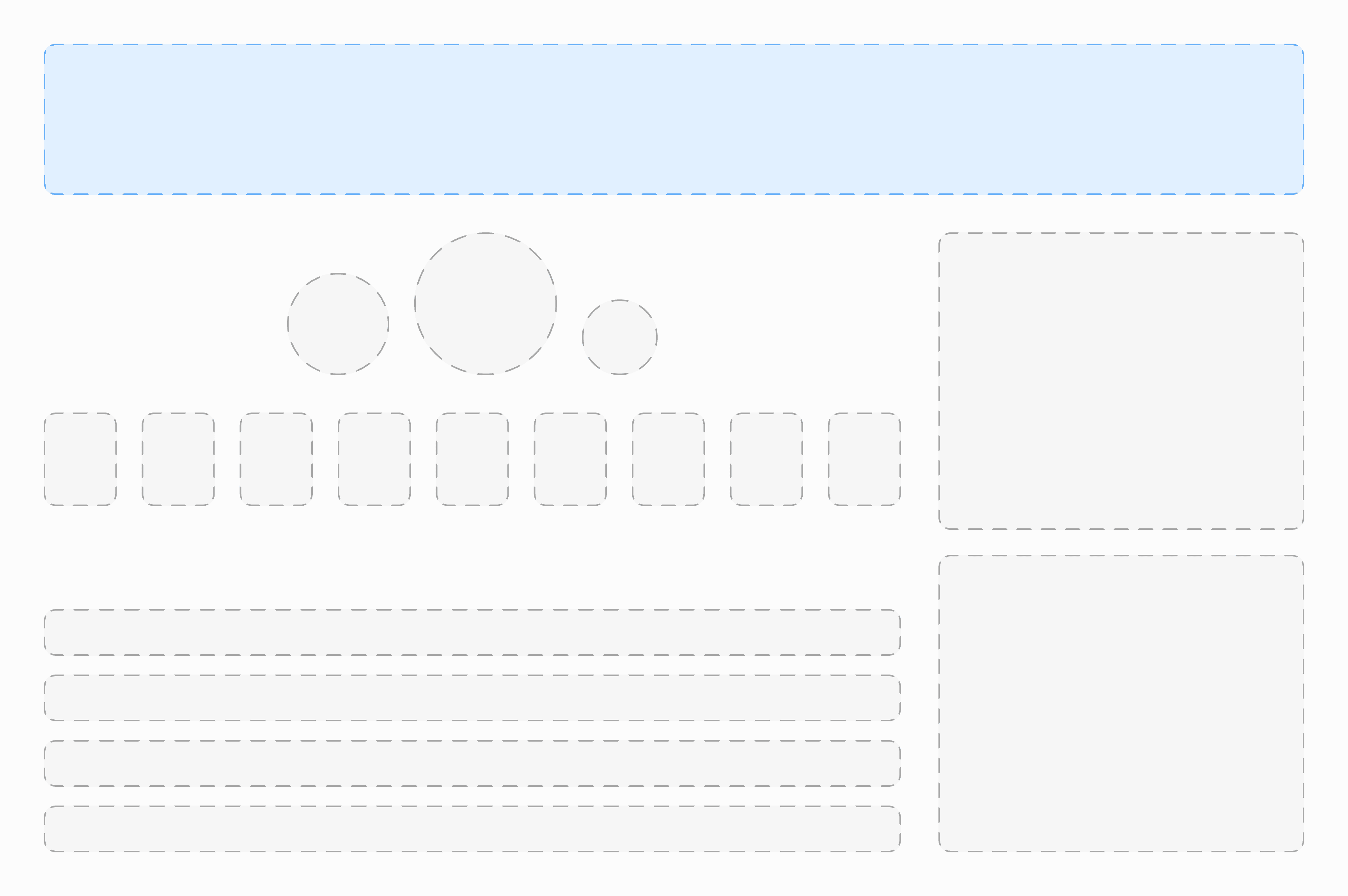
These quick pencil sketches (left) and basic digital thumbnails (below) helped the team focus on the right elements before moving to high-fidelity designs.

Design Iterations
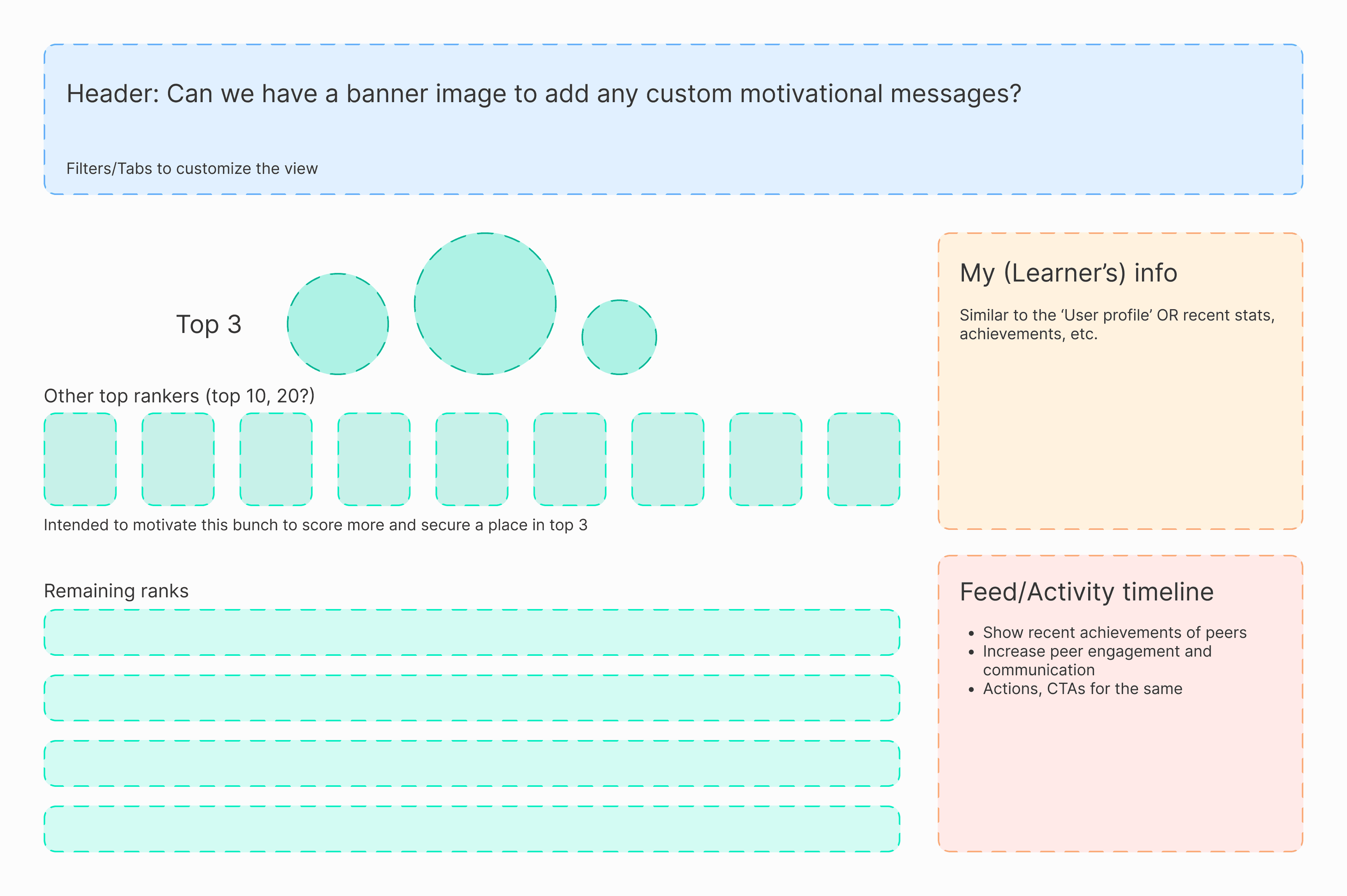
Page Header
Grouping the page title banner with the filter tabs streamlines the UI. Any filter you apply now consistently affects every section, from the Top 3 podium to the full rank list.
ITERATION 1

💡 Why 'My team' matters
A team-level leaderboard ensures fair comparison as every teammate tackles roughly the same content; while the global view inspires learners to aim higher across the organization.
💡 Time filters upfront
Displaying 'All Time' and 'Today' tabs side-by-side makes it clear how rankings reset and encourages fresh competition without surprises.
✅ What worked
Toggle Switches: Compact, familiar control for binary states.
Tabs: Exposes all options up front, reducing discovery friction. Users instantly understand the full range of views and can jump between them without hidden controls.
⛔️ What could be better
Toggle Switches: Hides options off-screen. Users don’t see all possible views at a glance (e.g. Company-wide, Monthly). Labels like “My Team” vs “Everyone” can be ambiguous until toggled.
Tabs: Requires careful grouping so tabs don’t overwhelm the title area.
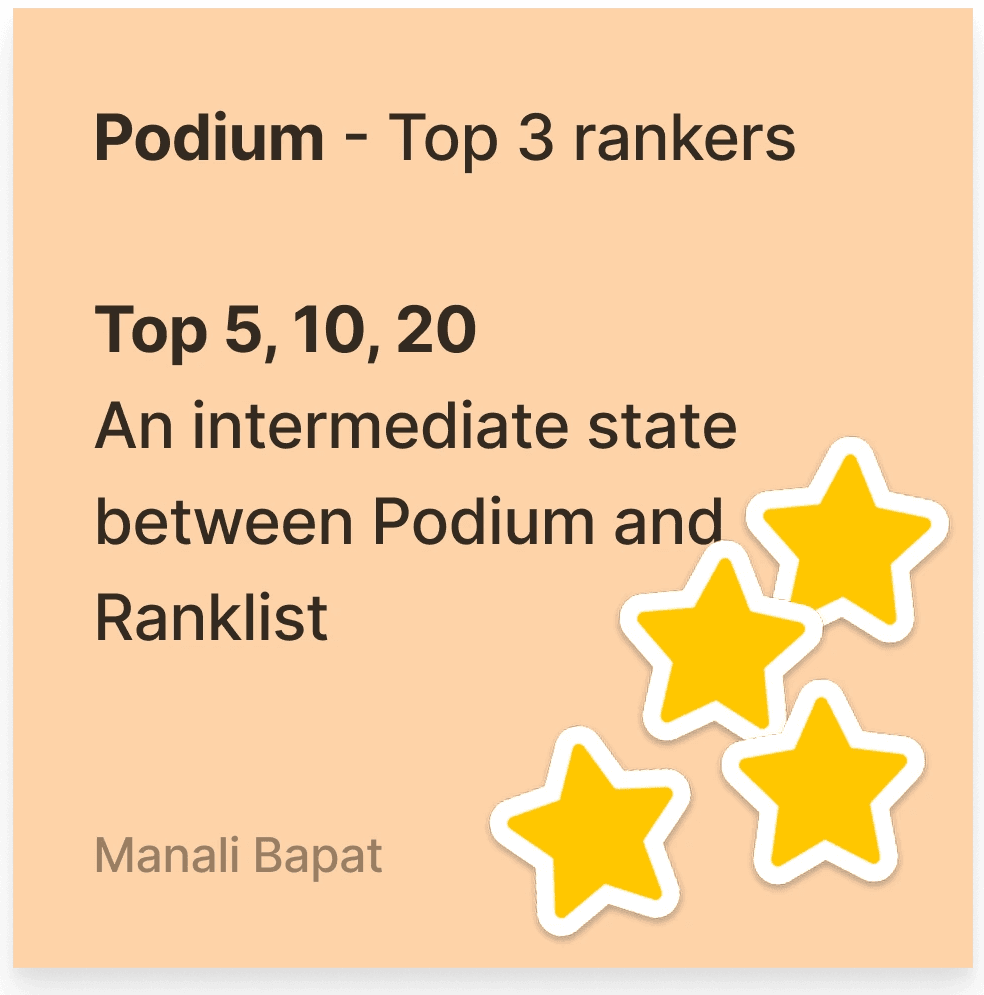
ITERATION 2

✅ What worked
Motivational banner: A full-width image header instantly grabs attention and sets a tone, whether it’s celebrating milestones, sharing custom tips, or reinforcing brand values.
Customizable banner messaging: Allowing admins to surface tailored calls-to-action (e.g. “Congrats to our top performers this month!”) makes the leaderboard feel alive and purposeful.
Integrated filters and tabs: Placing team/cohort tabs and time-range radio buttons directly beneath the banner ensures users can immediately dial into the view they care about.
⛔️ What could be better
Implementing a flexible template engine and admin interface takes significant design and engineering resources.
Thus, we slated this for a future release once our core leaderboard enhancements are complete.
ITERATION 3: Final layout

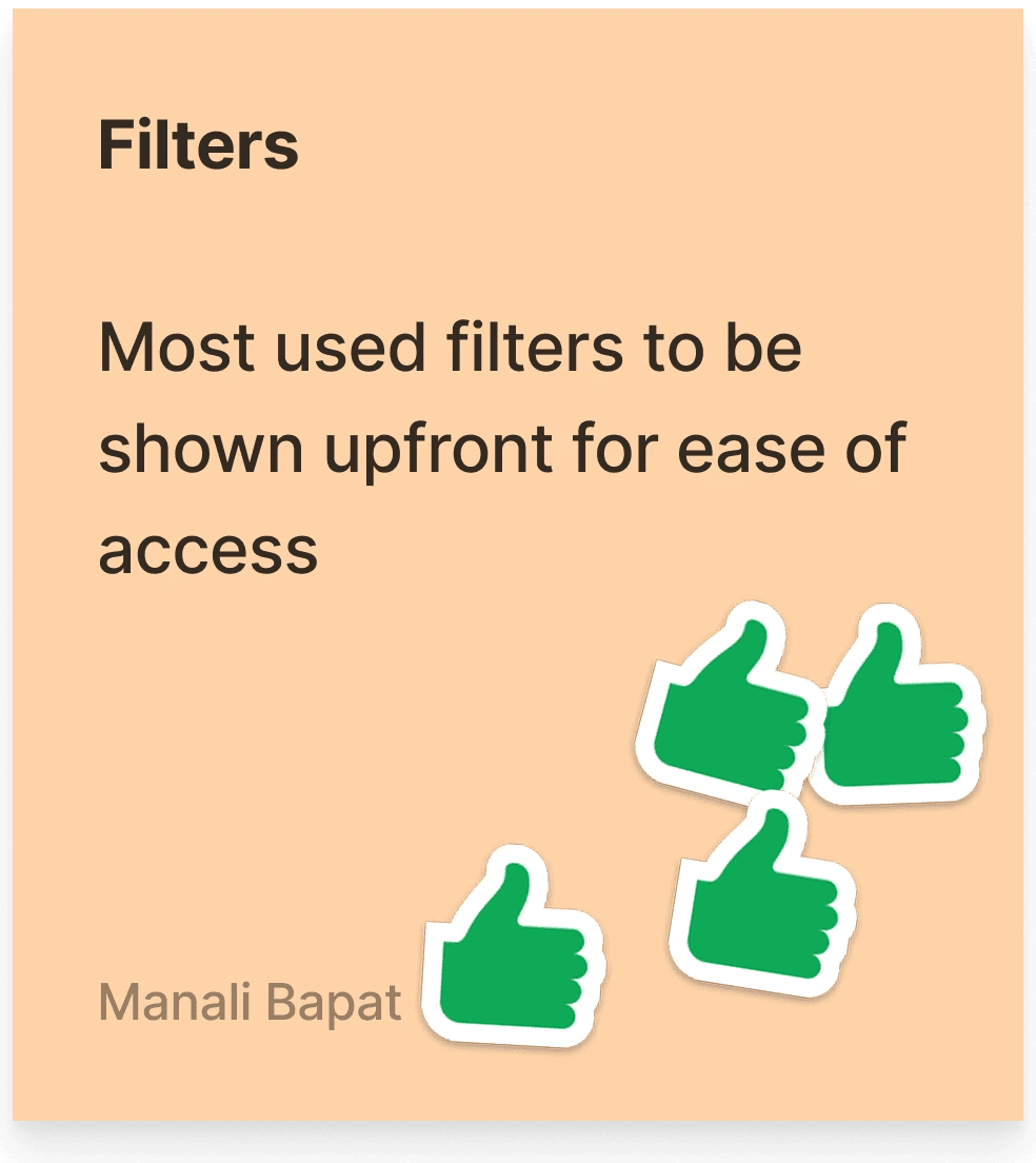
A clean, minimalist banner featuring a clear title and optional subtitle, with the top 3–4 most-used filters placed front and center for instant access, and the rest tucked into a 'More' dropdown.
Podium (Top 3 ranks)
I saw the podium as a mini celebration - instantly spotlighting the top three achievers and sparking a 'next time it could be me' drive in everyone else.
The design challenge was marrying that sense of triumph with Mindtickle’s existing visual language, making it feel both on-brand and delightfully distinct.
ITERATION 1: Establishing the core layout and iterating quickly to see what clicks

✅ What worked
Ultra-clean: Stripped-back visuals put every pixel to work.
Easy to read: ESimple sizing clearly distinguishes 1st, 2nd, and 3rd.
⛔️ What could be better
Low impact: Lacks visual flair, may feel underwhelming on first glance.
No personality: Doesn’t reinforce 'gamification' or a sense of accomplishment.
ITERATION 2: Experiment with vibrant, celebratory hues and focused visual cues - like spotlight glows and confetti accents, to underscore achievement

✅ What worked
Strong hierarchy: Bold ring colors immediately draw the eye to the champion.
Gamified feel: Numeric badges and subtle iconography (star, laurel) reinforce achievement.
⛔️ What could be better
The bright, varied hues clash with Mindtickle’s more restrained, cohesive color palette, making it feel off-brand.
Accessibility may suffer if color semantics aren’t paired with another cue.
ITERATION 3: A different approach of a custom background image to add instant focus and inject personality

✅ What worked
Immersive: Background images give emotional context (e.g. chess pieces for strategy).
⛔️ What could be better
Heavyweight: Large asset sizes and complex layering add development and performance costs.
Focus dilution: Background image can compete with the faces and numbers.
ITERATION 4: A minimalist, uncluttered layout with a few celebratory accents, all in Mindtickle’s brand color palette

✅ What worked
Balanced detail: Keeps a clean structure while still adding personality and celebration
Final layout


Other top rankers
We prioritized clarity - placing rank, name, avatar, and knowledge score at the top of the information hierarchy.
Once that was set, I ran through multiple layout iterations to land on the version that best balanced these elements within the page.


Rank-list
After rounds of iteration and team feedback, I landed on a ranked list that features learner profiles, knowledge scores, and badges. Adding badges prominently here injects an extra layer of motivation and drives actionable engagement.
ITERATION 1

✅ What worked
The linear left-to-right flow is logical, guiding the eye from rank position through identity to performance metrics and social cues.
The celebration icon introduces a new, more playful visual.
⛔️ What could be better
'Celebration' icon: Without a label or hover tooltip, its meaning may not be instantly clear
ITERATION 2

✅ What worked
Recent achievement: A sentence (“Finished … earned Silver badge”) tells a story.
Change indicator: The subtle upward arrow hints at progress.
⛔️ What could be better
Recent achievement: Its text-heavy nature competes with other elements. Long phrases risk being cut off on smaller screens.
Spacing and dividers: The lack of visual dividers makes the row look like one continuous sentence.
ITERATION 3: Final layout

✅ What worked
Name and details first: Learner’s name and role/location appear prominently at the start of the row. Subtext for location and department adds immediate context without overcrowding.
Displaying badges earned: Colorful badge icons with clear counts draw the eye and celebrate achievements at a glance.
Balanced layout: Details on the left and badges on the right create a clean, organized visual layout.
Learner profile

ITERATIONS
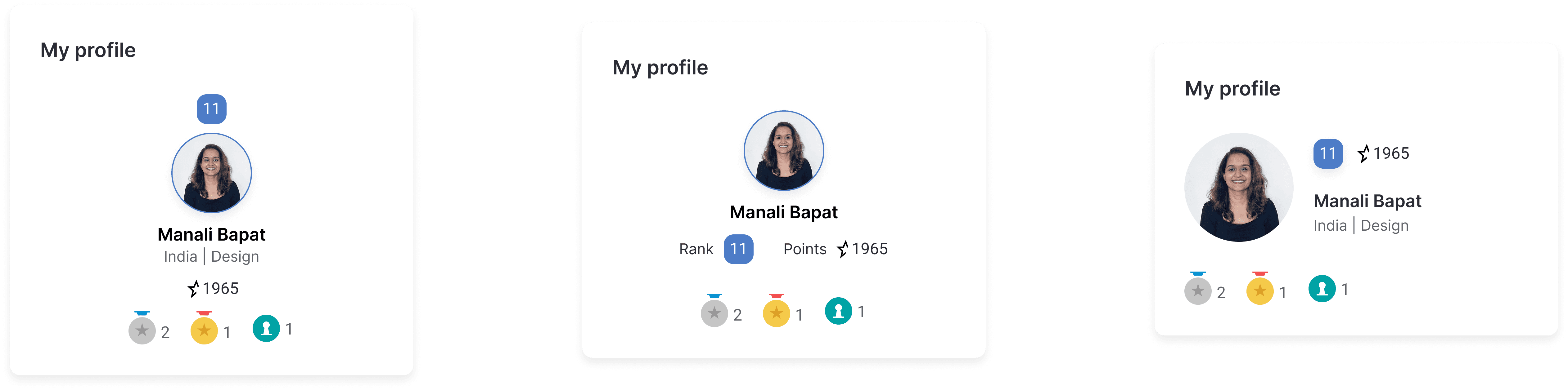


Final layout


Activity timeline vs Nudge notifications
Activity timeline: to surface achievements at a glance, spark peer interaction, and keep learners motivated.


Nudge notifications: Learner-specific alerts mirror Mindtickle's global notifications in format; but zero in on what’s next - outstanding modules, upcoming badges, and more actionable milestones.


Because it empowered learners to take immediate action, we chose this approach for our V1 release.
Final Design

Impact
👀 Increased Visibility
More learners engaging with the leaderboard.
👍🏼 Better User Feedback
Customers appreciated the improvements.
🎉 Success Despite Tight Deadlines
A meaningful upgrade in just four weeks.
Next Steps
Now that the foundation is stronger, we’re looking ahead at meaningful enhancements that continue to drive motivation, inclusivity, and engagement.

Adding time-based filters like weekly/monthly leaderboards gives learners more chances to show up, resetting the race and maintaining momentum.
“With time-based filters, more learners can reach the top—even if just for a week.”

Celebrating top performers each week/month encourages continued participation and makes learners feel seen and valued.
“Progress deserves a spotlight.”
Learning
Not every redesign needs to be a revolutionary overhaul. Sometimes, all it takes is a thoughtful fix, executed well.
As I led this fast-paced project, I had multiple interactions with PM during the process. After PRD, these discussions with PM shaped the product, and I learned the importance of asking the right questions early to get clarity and keep everyone on the same page.
As you work with developers more, you start getting an idea of how they think and what questions might come up during design reviews. This practice enabled me to consider edge cases and address potential concerns beforehand.
Keeping meetings on track and ticking off agenda items is an underrated skill! This project helped me practice this, ensuring discussions were productive and decisions were made efficiently.